Movico planning and operations team
EasyLog resource planner
A full redesign of a serious resource-planning workspace, built around projects, resources, allocations, conflicts, and time.
Resource planning
Real planning work.
A serious scheduling product rebuilt around time, projects, resources, capacity, overlap, and change.
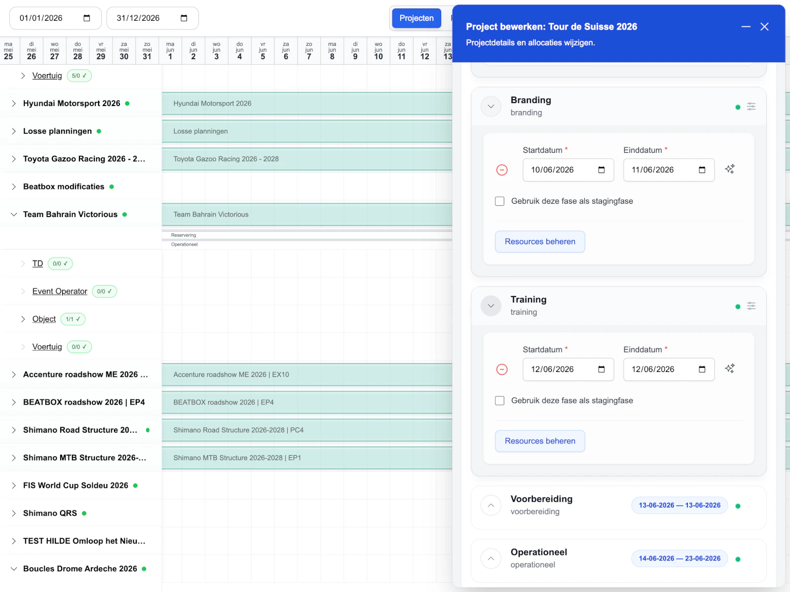
Two planning views
Projects and resources each get a proper workflow.
Direct timeline
Move and resize allocations where the plan lives.
Edit in context
Change phases and resources without losing the schedule.
Dense, still clear
Complex planning stays fast to scan and control.
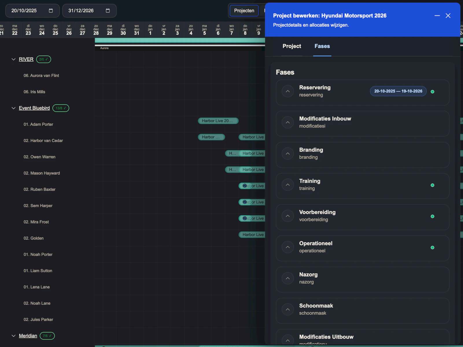
A planning workspace people can actually work in.
This was a full redesign of a serious planning product. I handled the whole thing: analysis, UX, interface design, coordination, testing, and refinement. End to end.
The product had to support real planning work. Projects, phases, resources, allocations, conflicts, notes, and changes. A lot of moving parts. The challenge was making all of that feel clear, fast, and usable without flattening the complexity that makes the tool valuable.
So I rebuilt the experience around how planners actually work: across time, projects, resources, capacity, overlap, and change.
01
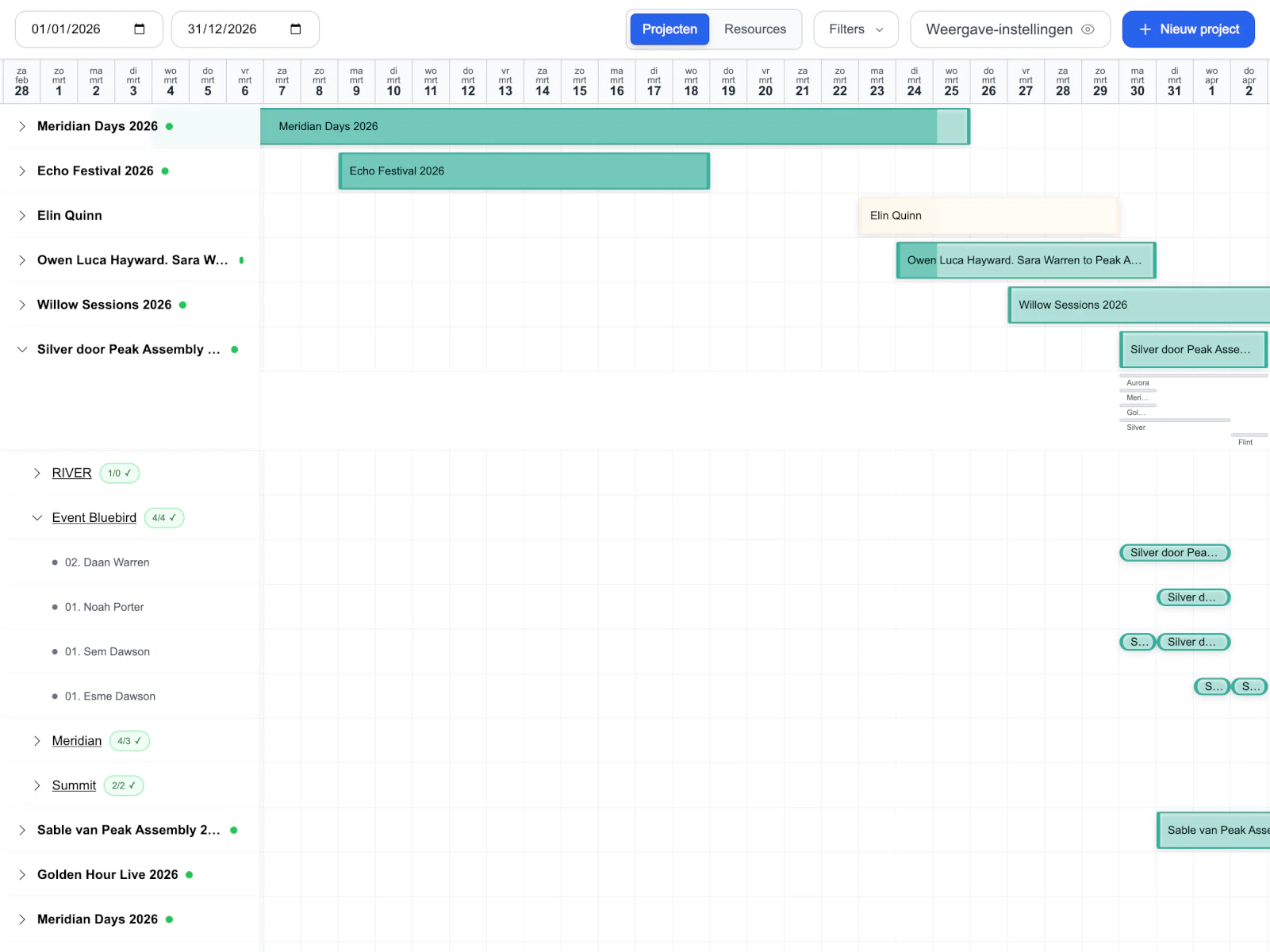
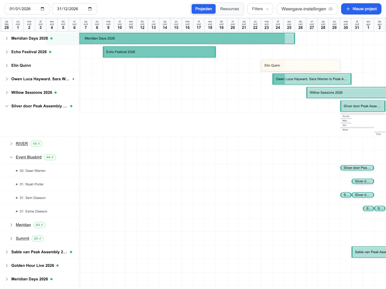
Project view
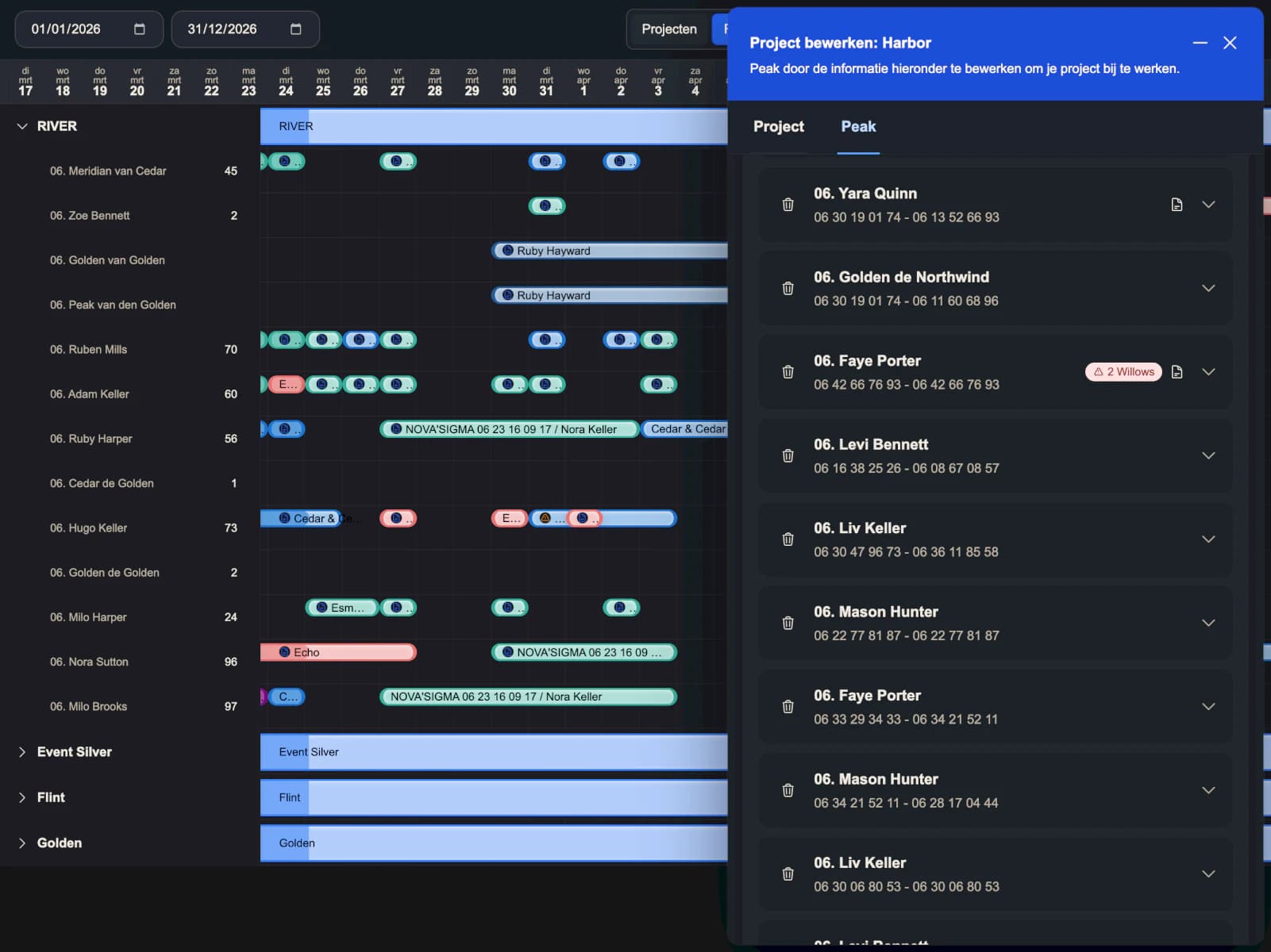
A clear way to understand what is happening inside one project across phases, resources, and dates.
02
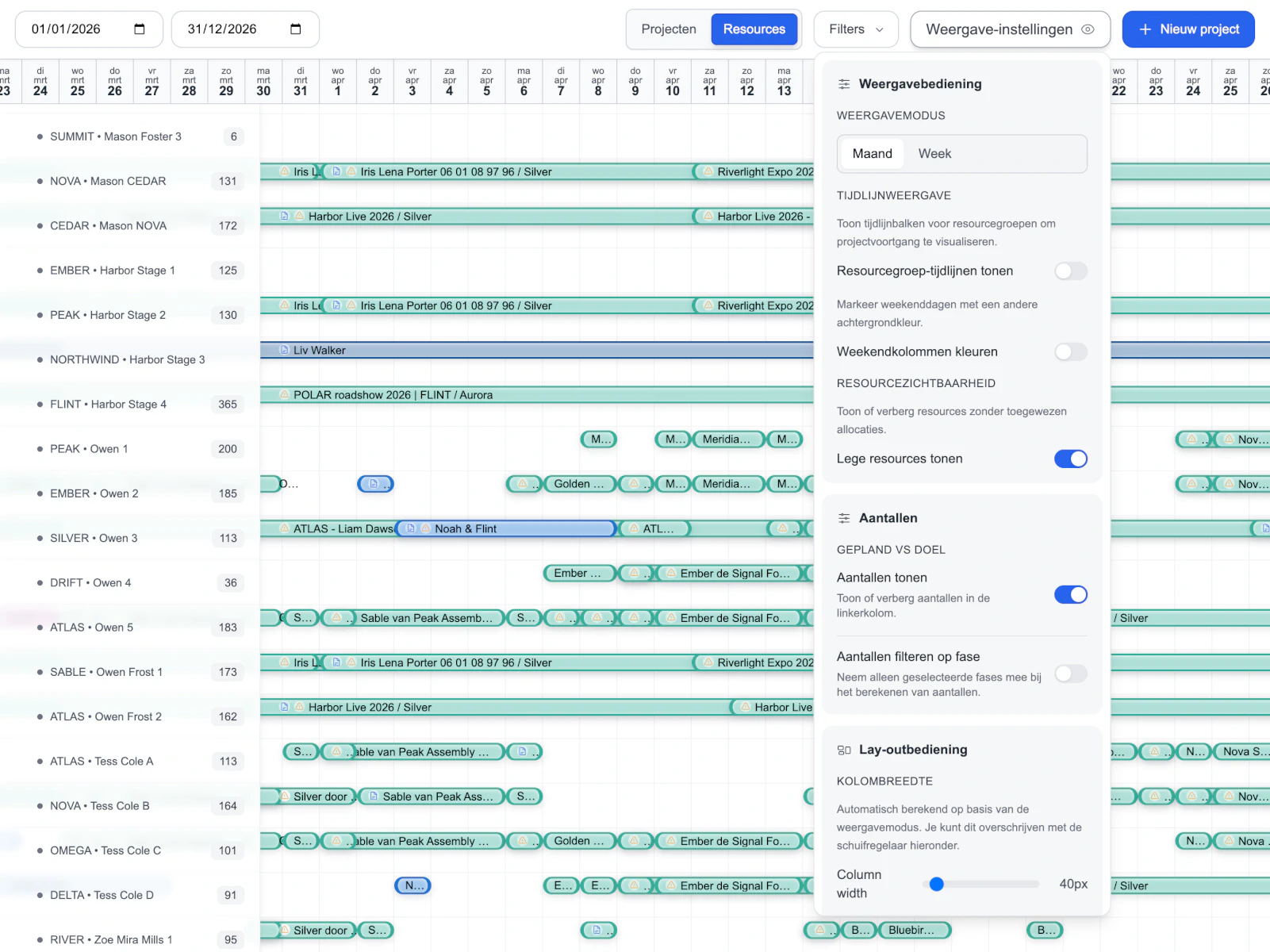
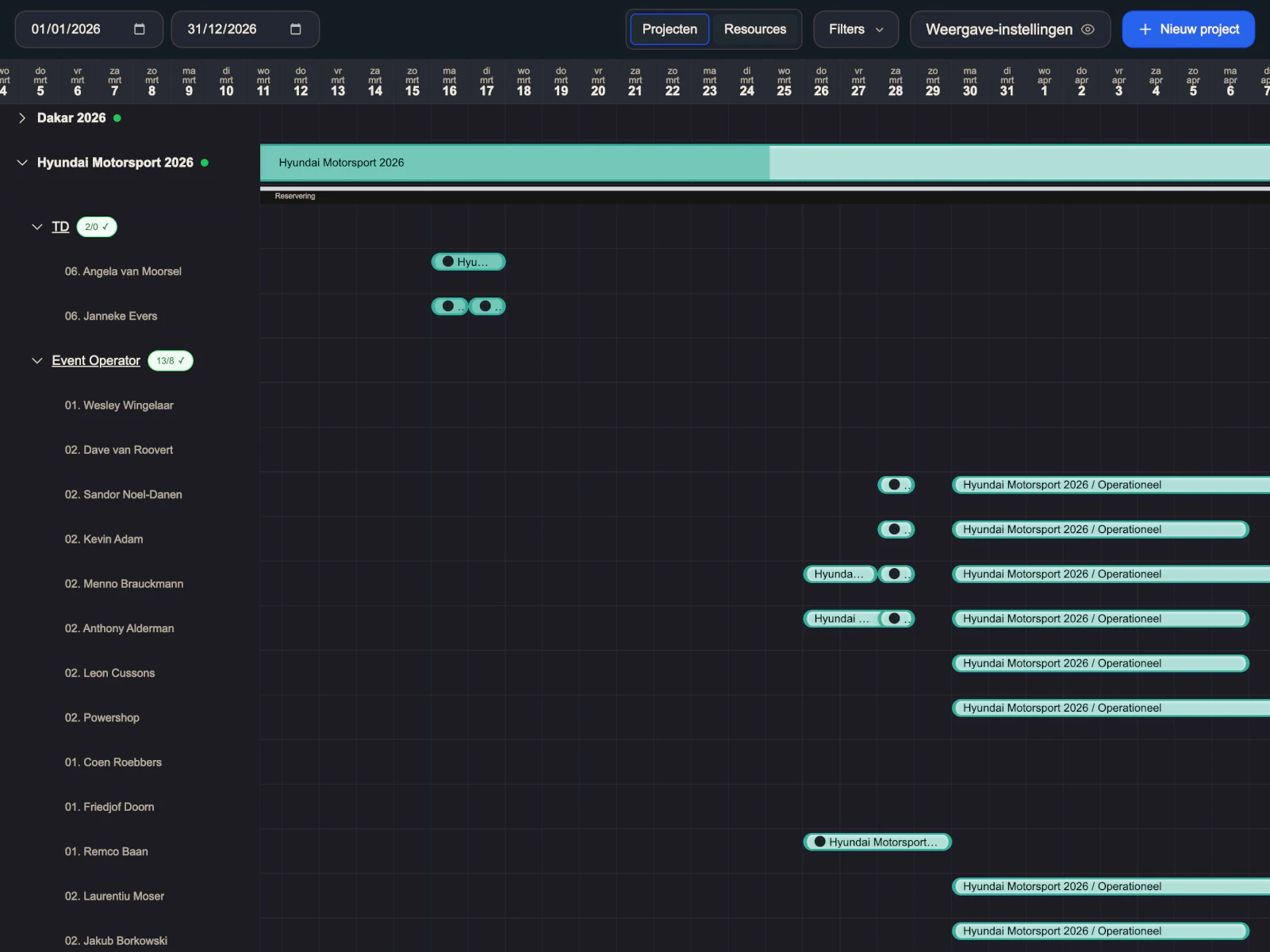
Resource view
The opposite mental model: what a team, group, or resource is doing across the full schedule.
03
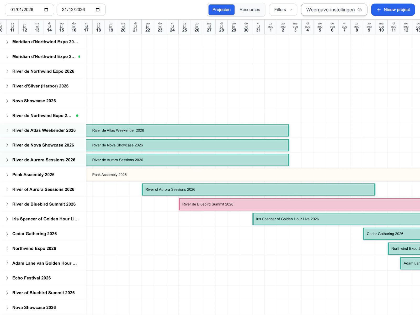
Direct timeline
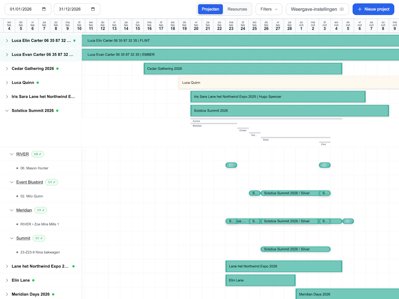
Bars became meaningful objects that can be scanned, dragged, resized, and understood in context.
04
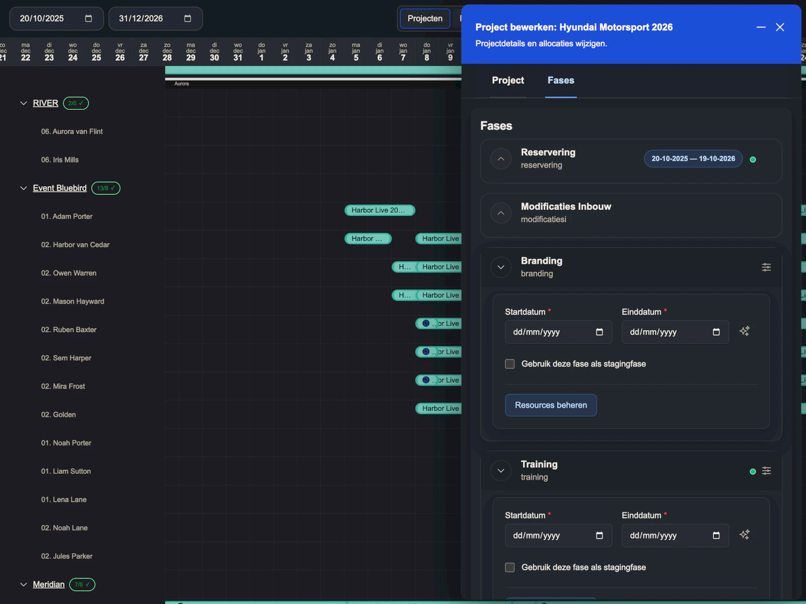
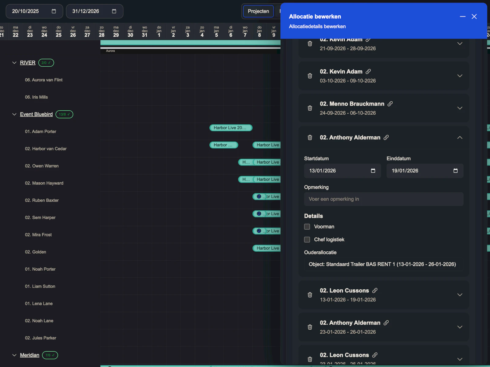
Contextual editing
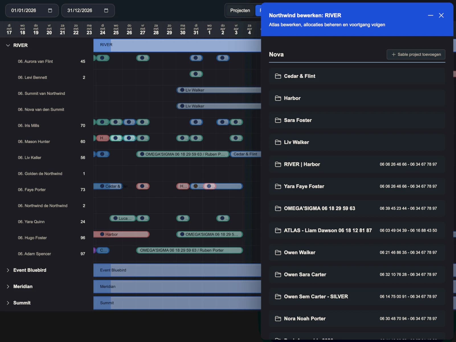
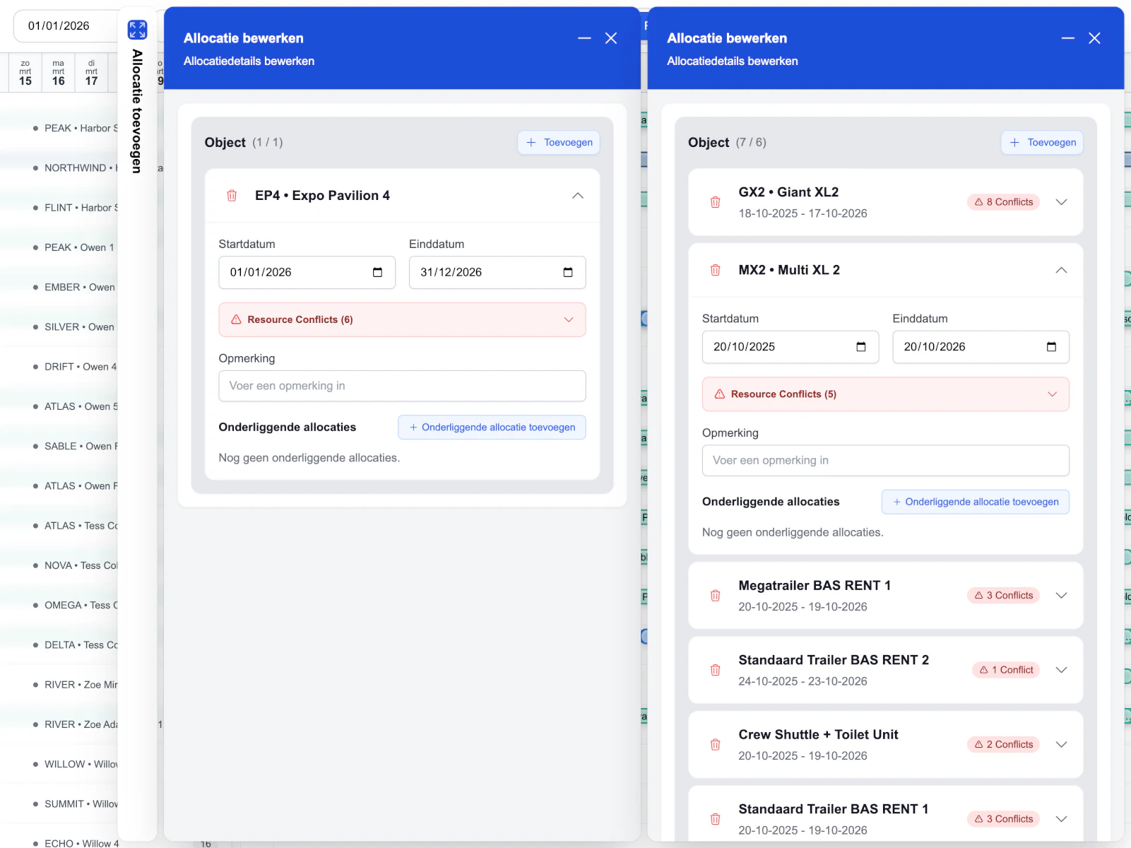
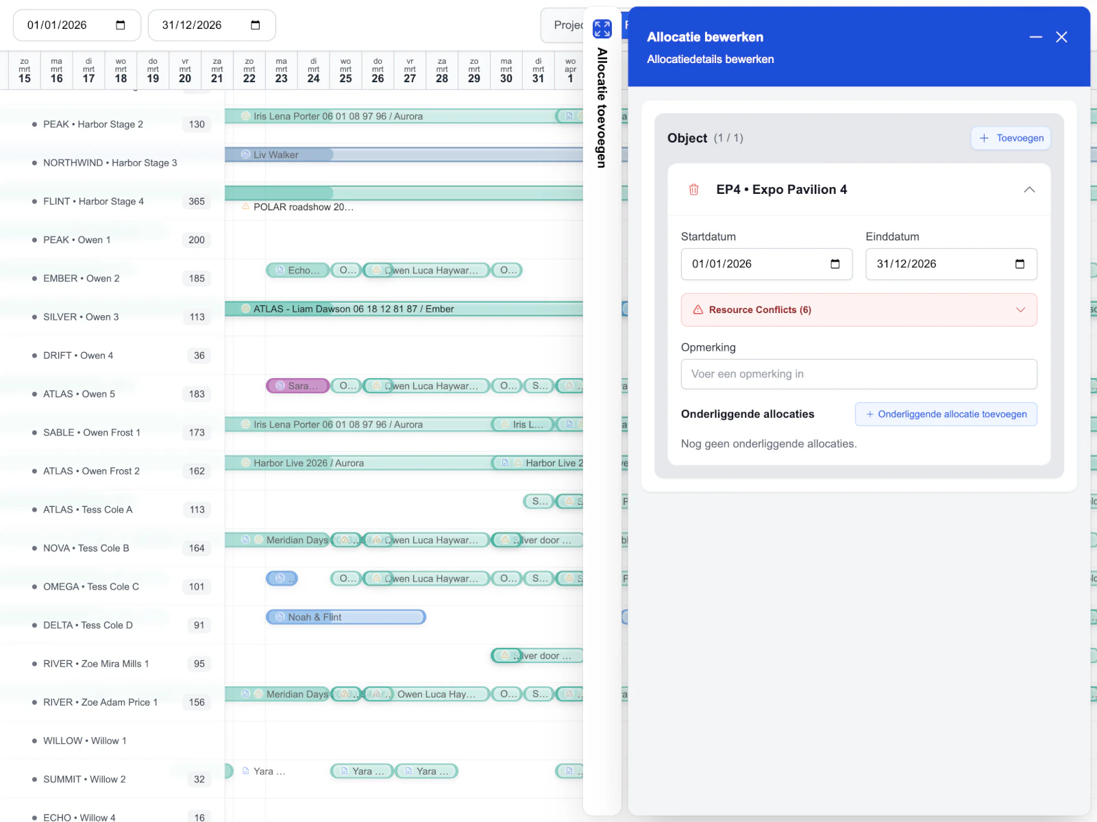
Drawers keep the planning surface visible while people edit projects, phases, and allocations.
Two ways to think, not one rigid dashboard.
One of the strongest challenges was giving users two ways to work: project view and resource view. Sometimes the question is what is happening inside this project. Sometimes it is what this team is doing across the schedule.
Both matter, so both got a proper interface.
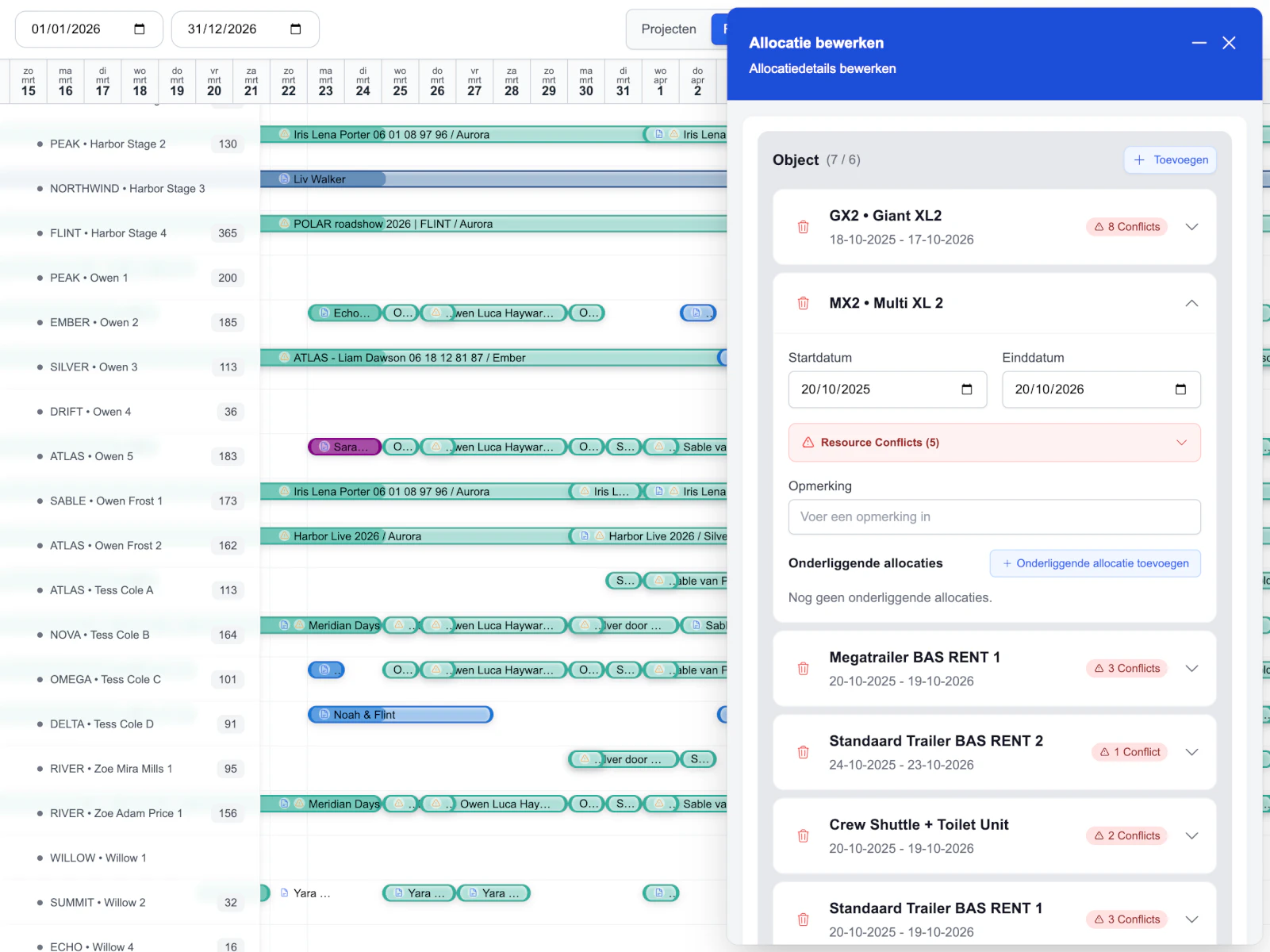
Project first
Delivery view
Start with the project, then go deeper into phases, groups, allocations, notes, and requirements.
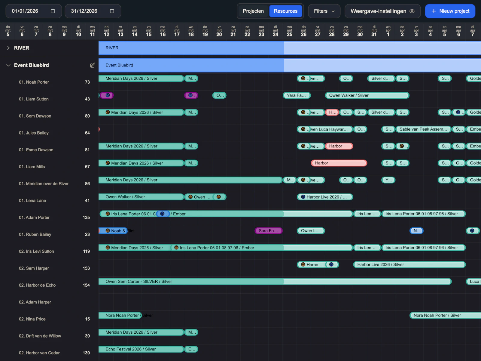
Resource first
Capacity view
Start with the people and groups, then inspect how their work lands across the schedule.
Working surface
The timeline became the product.
Not just something to look at. Users can scan the big picture, expand rows, drag and resize allocations, and get feedback where the plan actually lives.
The product stays anchored while the work gets detailed.
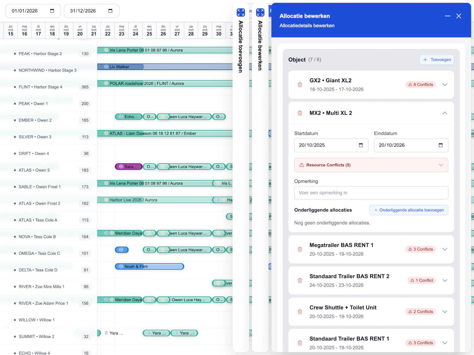
Editing happens in side drawers instead of separate pages, so the schedule stays visible while users make changes. Users can open a project, go deeper into a phase or allocation, and move through nested sidebars without losing their place in the timeline.
Creating new allocations was treated the same way. From the resource side, users can quick-add allocations with the right context already in place, like resource, start date, and default phase.
Stay in context
Edit beside the plan.
Projects, phases, allocations, requirements, and notes open in drawers instead of separate pages. The schedule stays visible, so the user stays mentally anchored.
Adjustable enough for real planning habits.
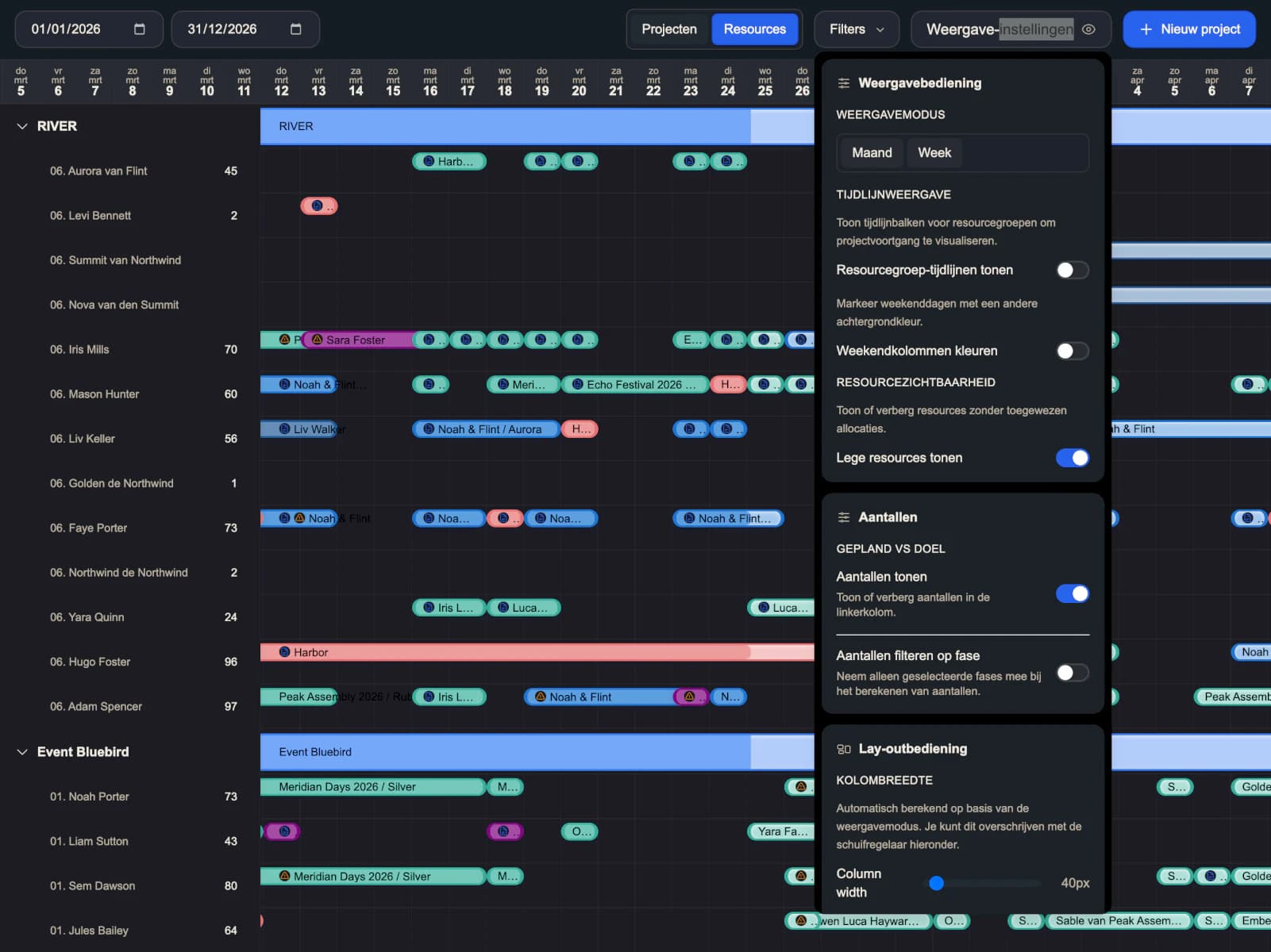
The workspace is highly adjustable. Users can change date range, density, filters, visible detail, timeline width, and view settings based on how they prefer to plan. Some need overview. Some need detail. Some are looking for conflicts. Some are balancing capacity.
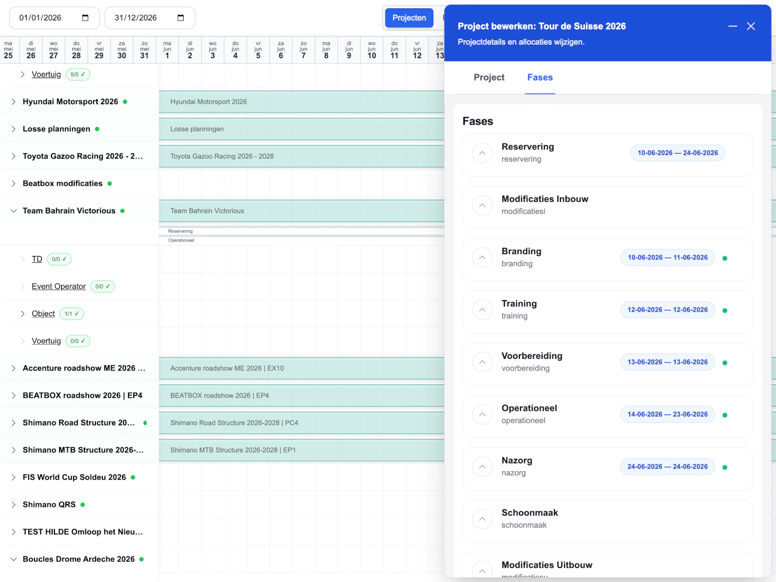
A lot of the strongest UX is in the smaller decisions too. Expanded rows reveal more detail without breaking the overview. Filters are easy to find and easy to reset. Conflicts, notes, requirements, and status stay close to the workflow.
Workspace states
Dense, not messy.
Filters, view settings, active states, nested rows, and planning details had to stay readable when the product got busy.
Under the hood
Fast enough for daily work.
01
Virtualized timeline rendering
02
Optimistic planning updates
03
Persistent view and scroll state
04
Metadata-driven forms
05
Conflict grouping and validation
06
Authenticated API workflows
Safe to say, this was not a simple dashboard.
Under the hood, I pushed it properly too. Virtualized timeline rendering, optimistic updates, persistent workspace state, conflict handling, and metadata-driven forms. The result is a product that feels fast, stable, and under control.
In the end, that was the job. Make a dense planning tool feel clear. Make a powerful product feel usable. Make it feel like a real workspace.
The interface is information-dense, but still structured, controllable, and fast to navigate. That is what makes it feel like a real workspace instead of a static dashboard.
superhuge
EasyLog project note