Puma innovation and retail team
Puma Blackstation
A full digital product for Puma Blackstation, built around a branded 3D world, wallet-aware states, and a token-to-utility flow that connected digital ownership to real products.
I am proud of this one
I am proud of this one for a lot of reasons.
Because it was for Puma, obviously. Because it landed in a huge cultural moment. Because it brought fashion, product, streaming tech, web3 logic and real-world utility into one experience. Because people genuinely got something out of it. And because a lot of ambitious moving parts came together cleanly.
Puma / BlackstationNYFW / 2022
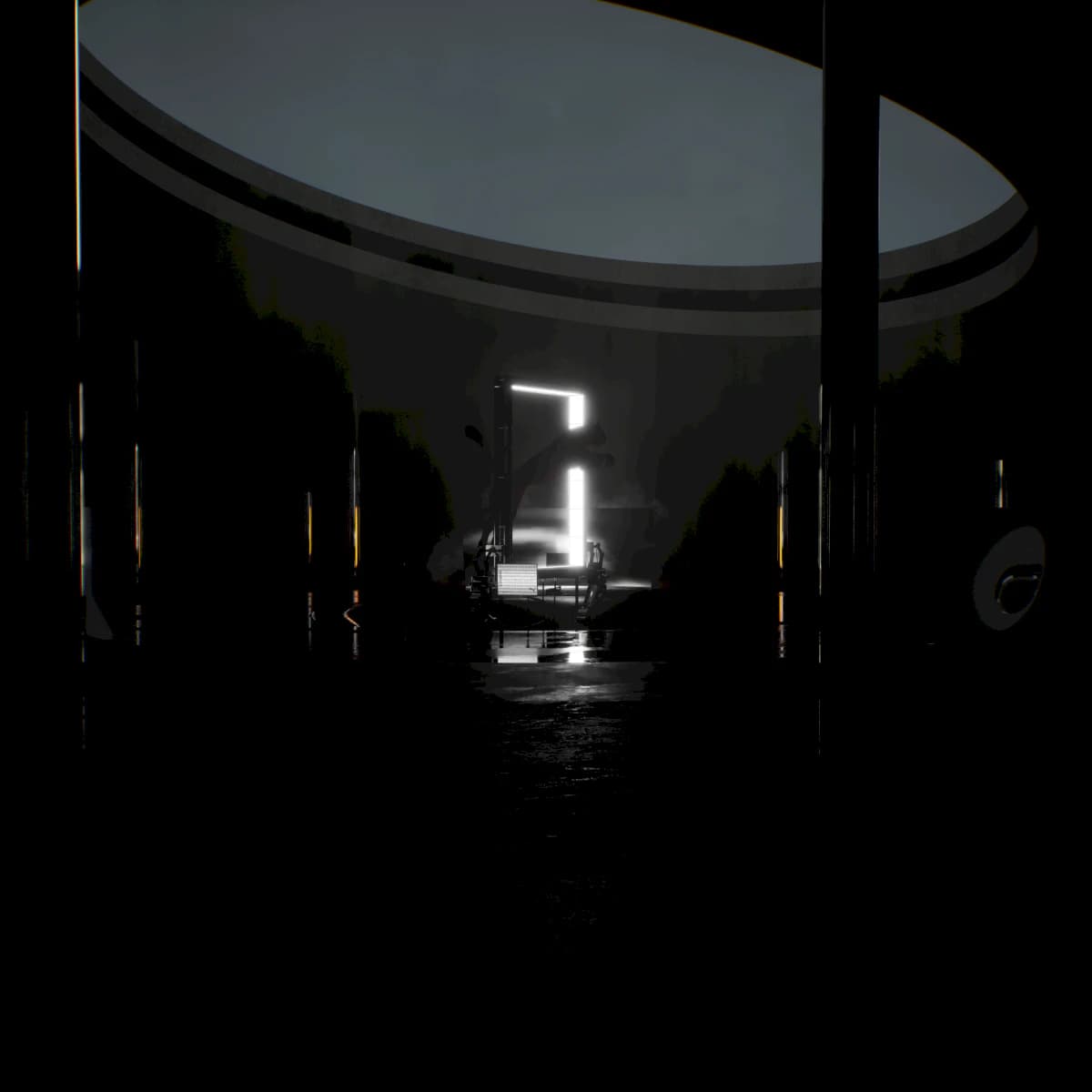
Black Station
Not just vibes. Actual shoes.
01
Streamed 3D world
A Puma-owned space people could enter and move through without the tech getting in the way.
02
Wallet-aware access
Ownership state changed the route while the product stayed readable.
03
Physical product claim
The digital drop connected back to real shoes people could claim.
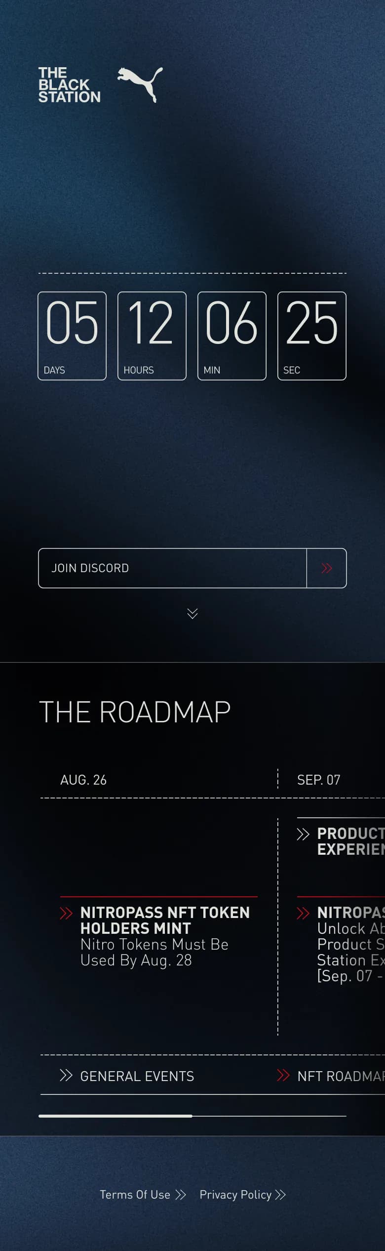
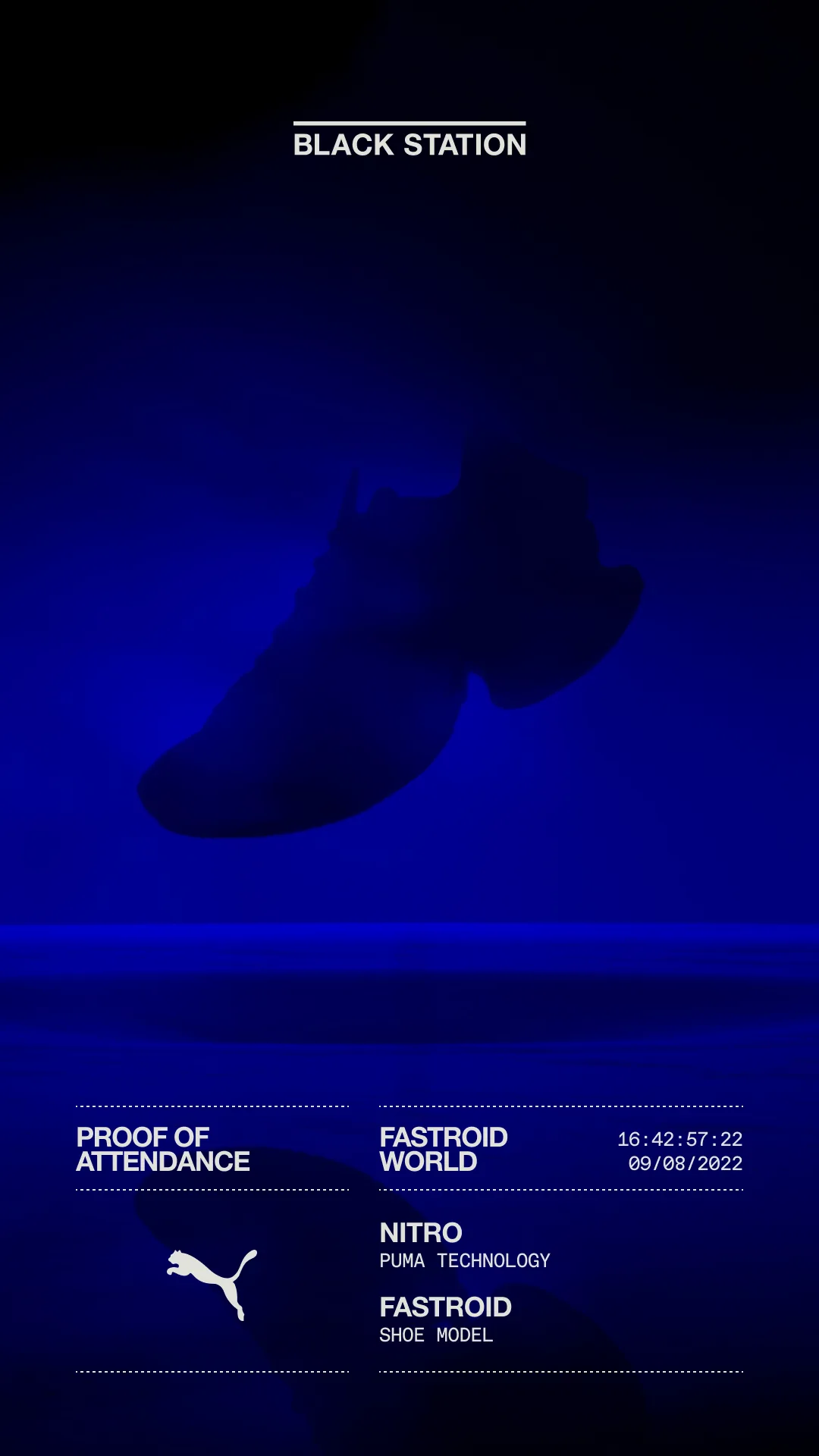
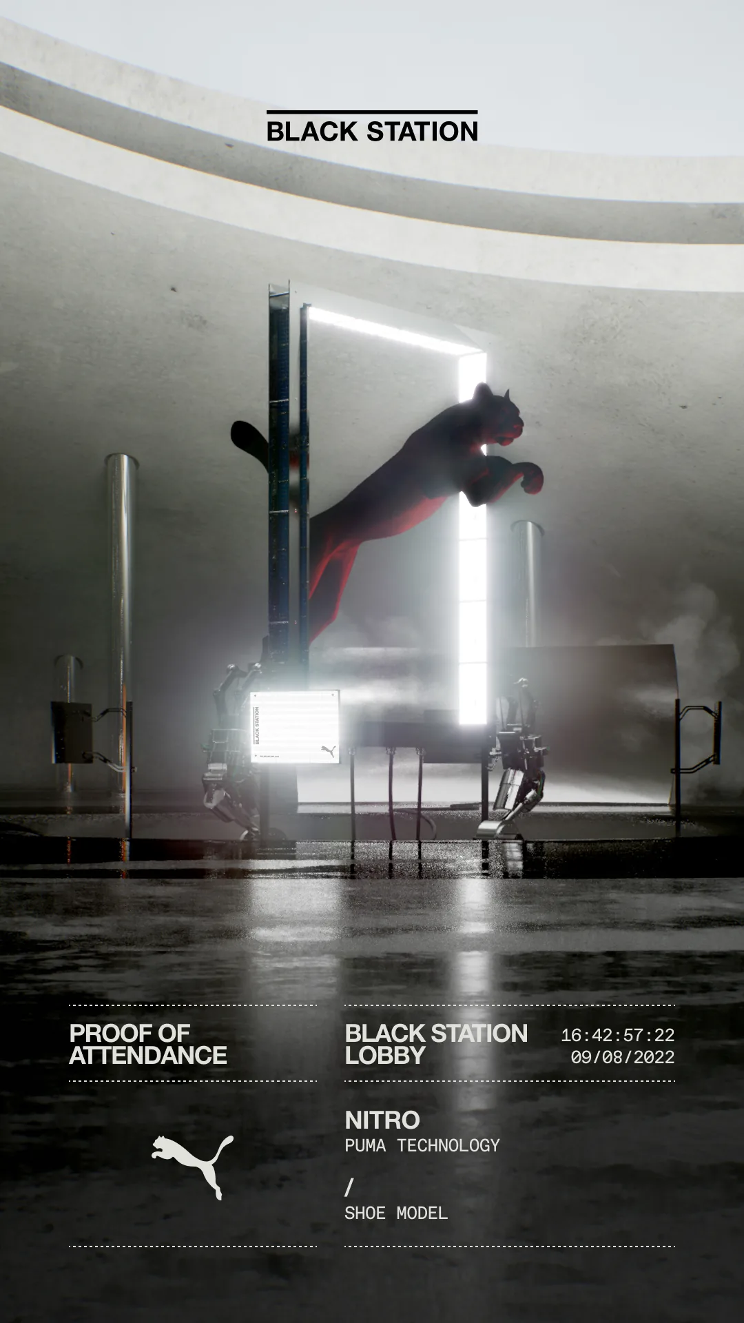
Safe to say, this wasn't a simple microsite.
That alone made it a pretty wild brief.
This was Puma stepping into web3 when the whole space was moving at full speed. Hype everywhere. Big promises everywhere. Most of it disappeared into thin air not long after. Black Station actually had something real at the center of it.
People could enter the experience, connect their wallet, move through token-aware states, and end up with access to unique products in the physical world. Including actual shoes. Proper ones. Not just vibes and Discord roles.
That is a big part of why this project still stands out to me.
01 / Launch system
Hype with a handle.
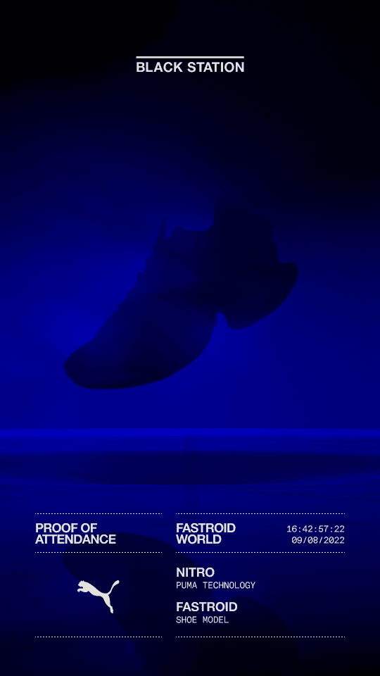
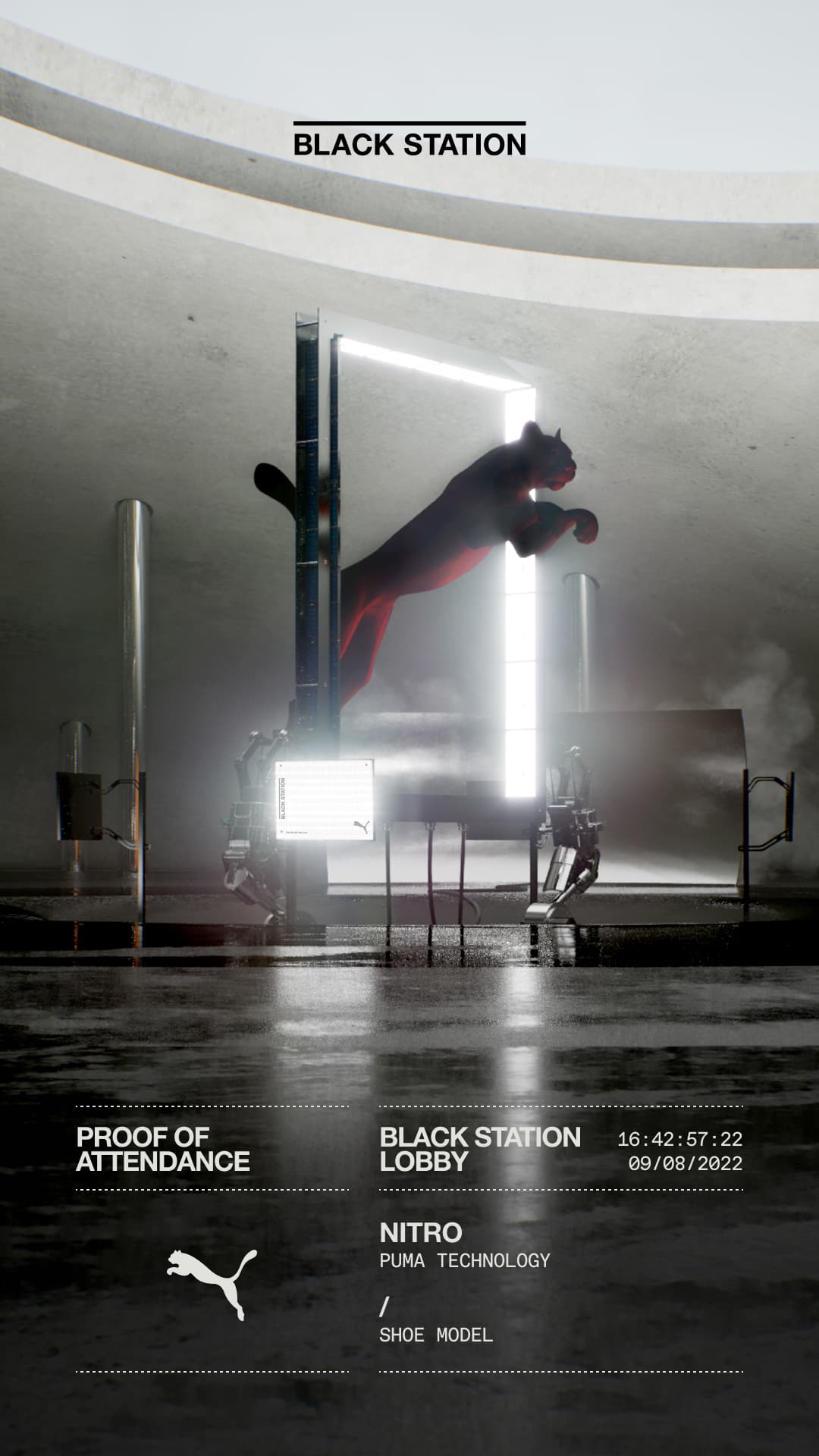
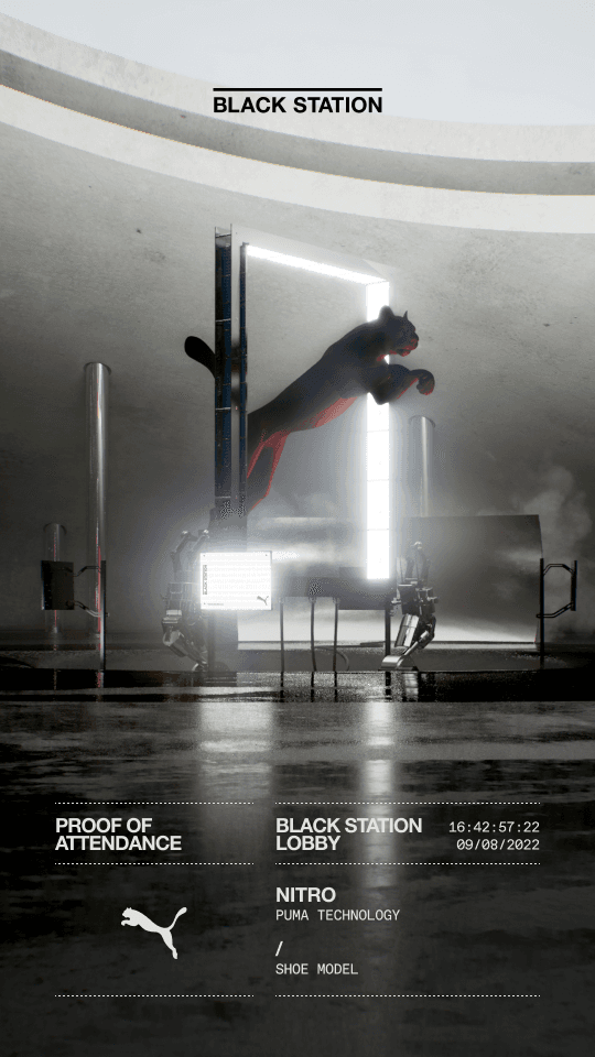
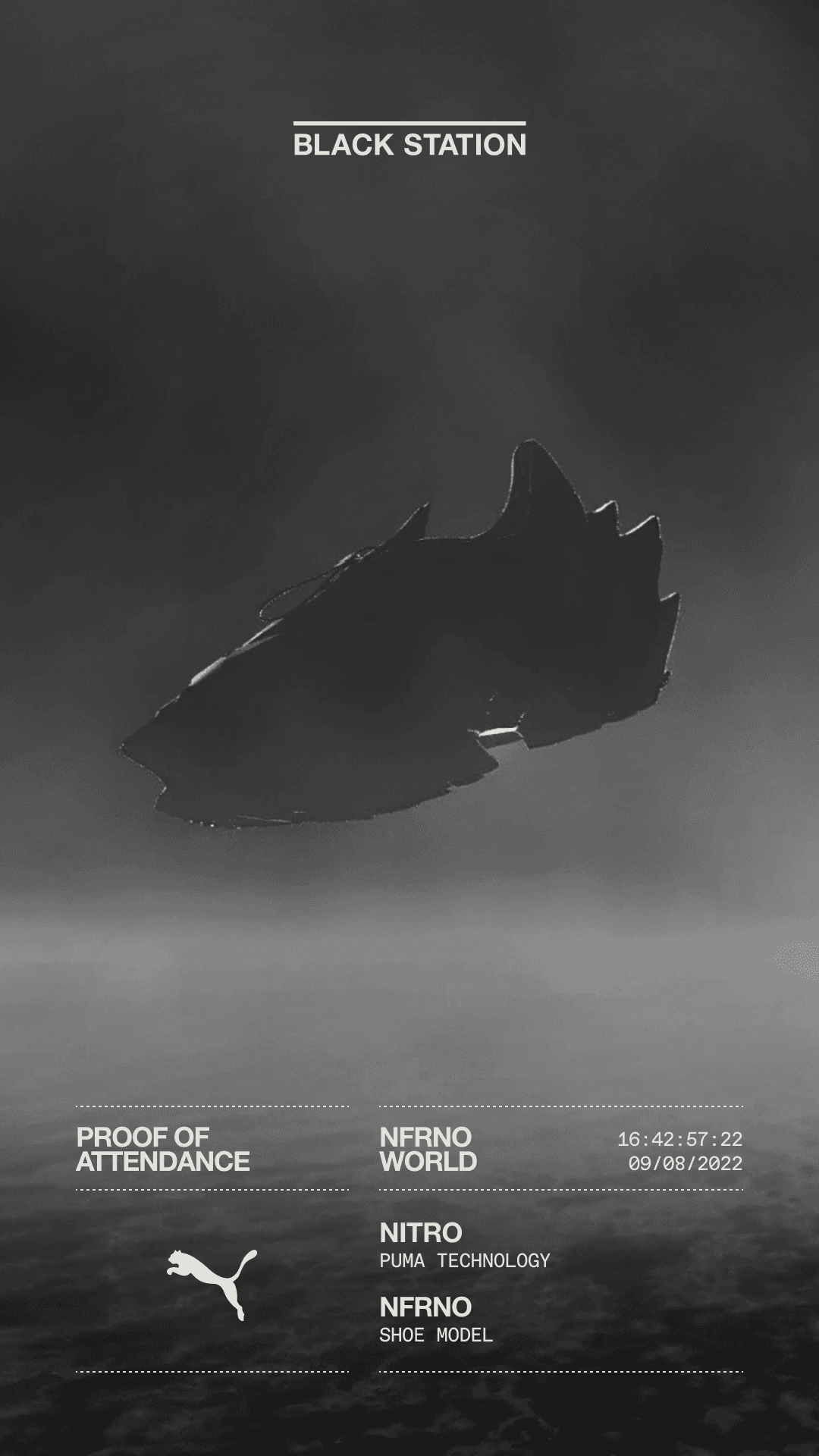
Share cards stayed loud, but the system still had to point people cleanly into the drop.
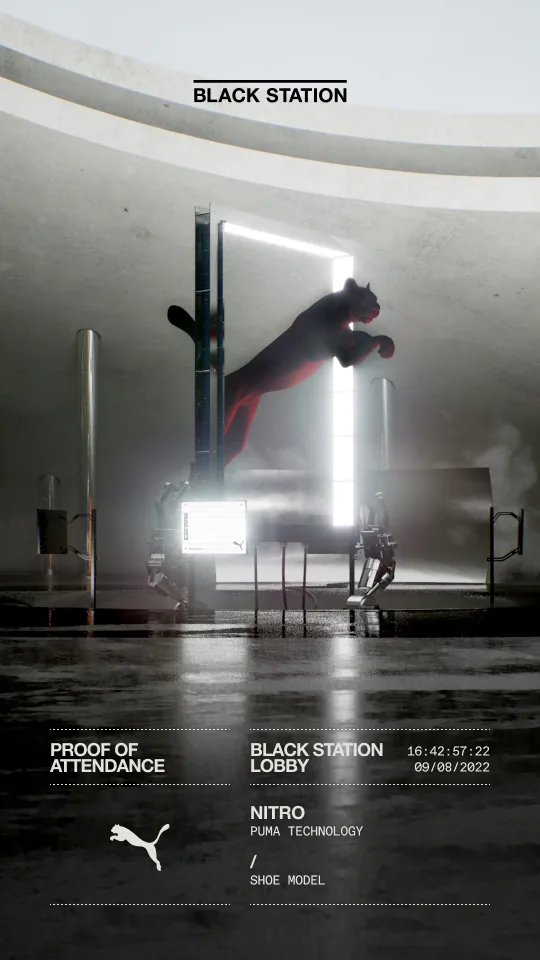
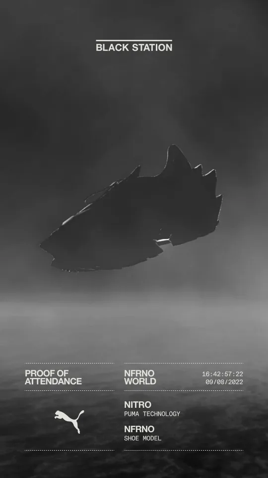
One journey, a lot underneath
The experience had to do a lot. It had to feel like Puma. It had to feel futuristic. It had to carry the energy of Fashion Week. It had to make wallet logic, token utility, and a streamed 3D world feel like one clear journey instead of three separate ideas awkwardly living on the same domain.
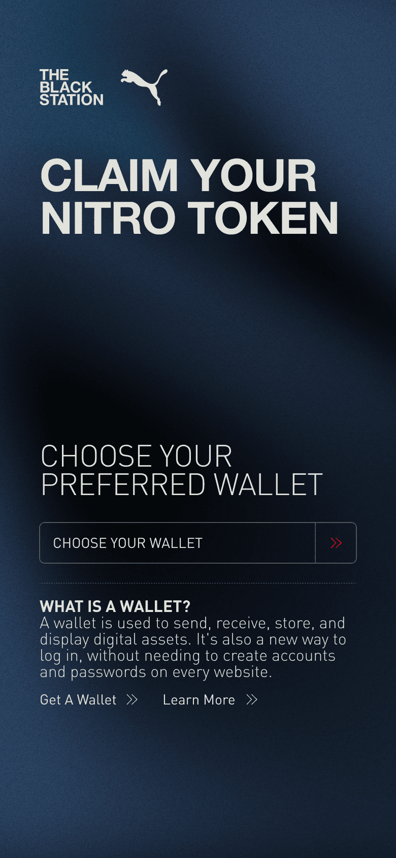
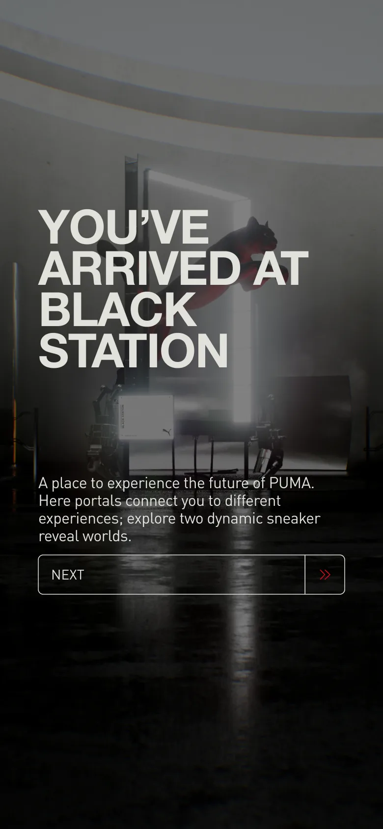
People arrived at a sharp branded front door, connected their wallet, moved through token-aware access states, learned the controls, and stepped into a streamed interactive world. From there, the product had to keep delivering.
Front door01
Sharp branded entry
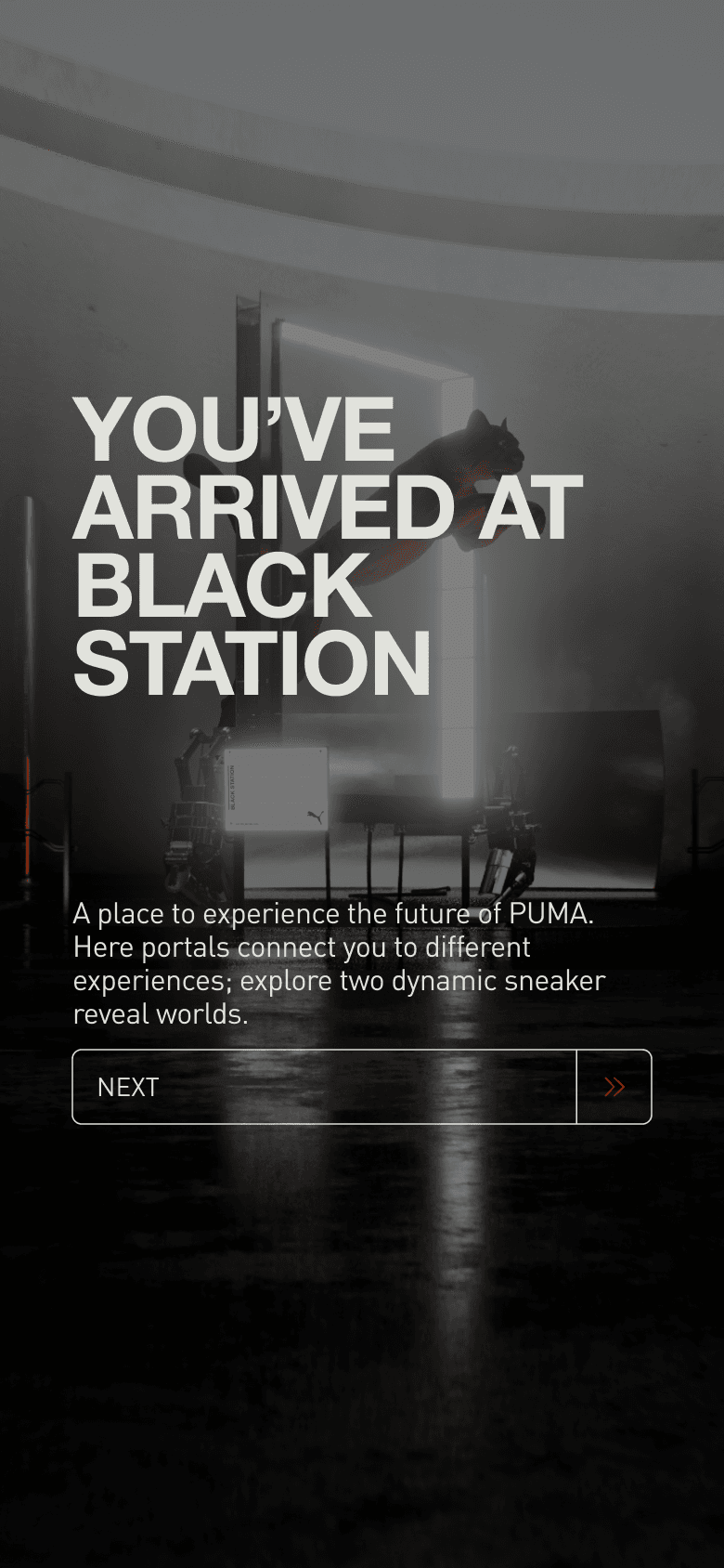
People arrived in a Puma world first, with the product logic staged after the brand moment had done its job.
Access02
Token-aware states
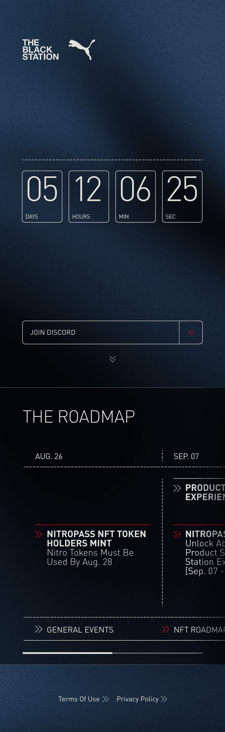
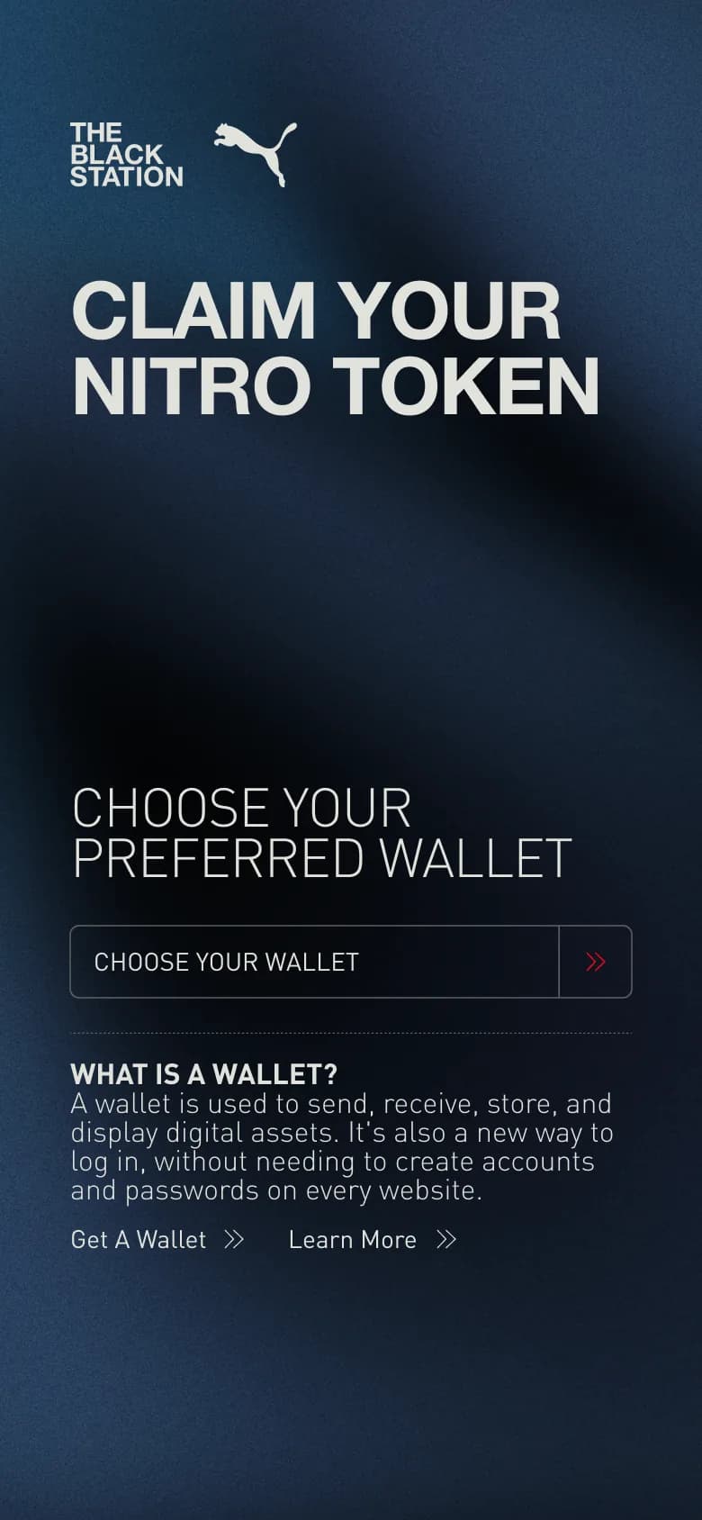
Wallet and ownership state changed the path through the experience without turning the flow into a crypto puzzle.
World03
Streamed 3D product surface
Queueing, loading, controls, audio, teleporting, screenshots, and alerts all had to feel like one smooth interface.
Utility04
Physical product payoff
The digital journey connected back to actual product access, including limited Puma shoes people could claim in the real world.
02 / Product states
Enter. Learn. Claim.
Wallet state, world entry, and product access had to read as one sequence.
01
Enter
02
Understand
03
Claim
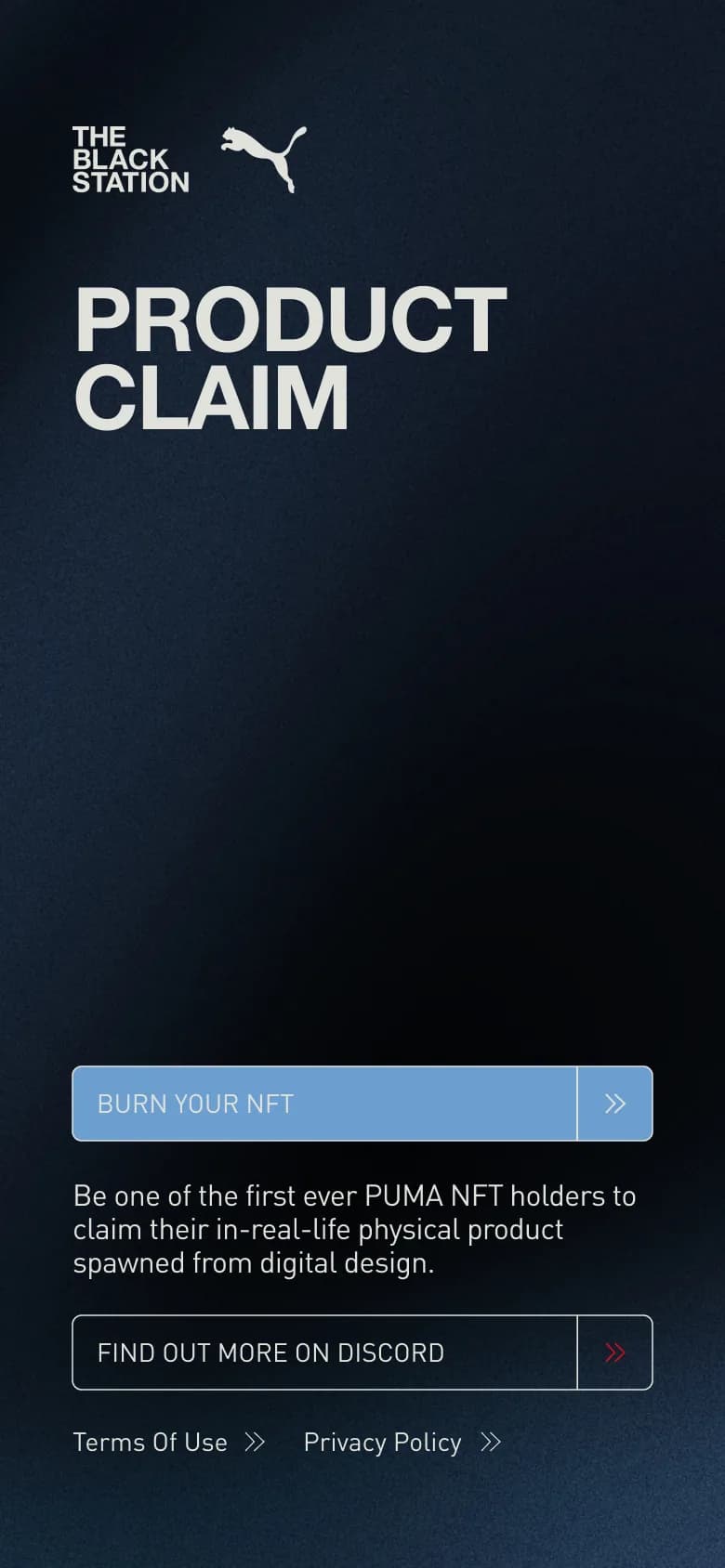
The invisible product work
Queueing, loading phases, fullscreen, audio controls, touch support, teleport navigation, alerts, countdowns, camera tooling, screenshots. A lot of machinery sat underneath the experience, and all of it had to feel smooth.
That kind of work gets invisible when it goes well. Which is exactly the point.
I built this together with FTR and a wider team. The wallet work was handled by others. My side covered the streamed 3D world and everything around it that made the product work properly: integration, backend, UX, frontend, controls, state handling, and the full end-to-end flow around the world itself.
That meant making the whole thing feel exciting without becoming confusing. Wallets come with steps. Streaming comes with waiting. Interactive 3D comes with a learning curve. Mobile comes with its own set of challenges too.
So a lot of the job was in flow, pacing, guidance, feedback, and making sure people always knew what was happening and what to do next.
The system around the spectacle
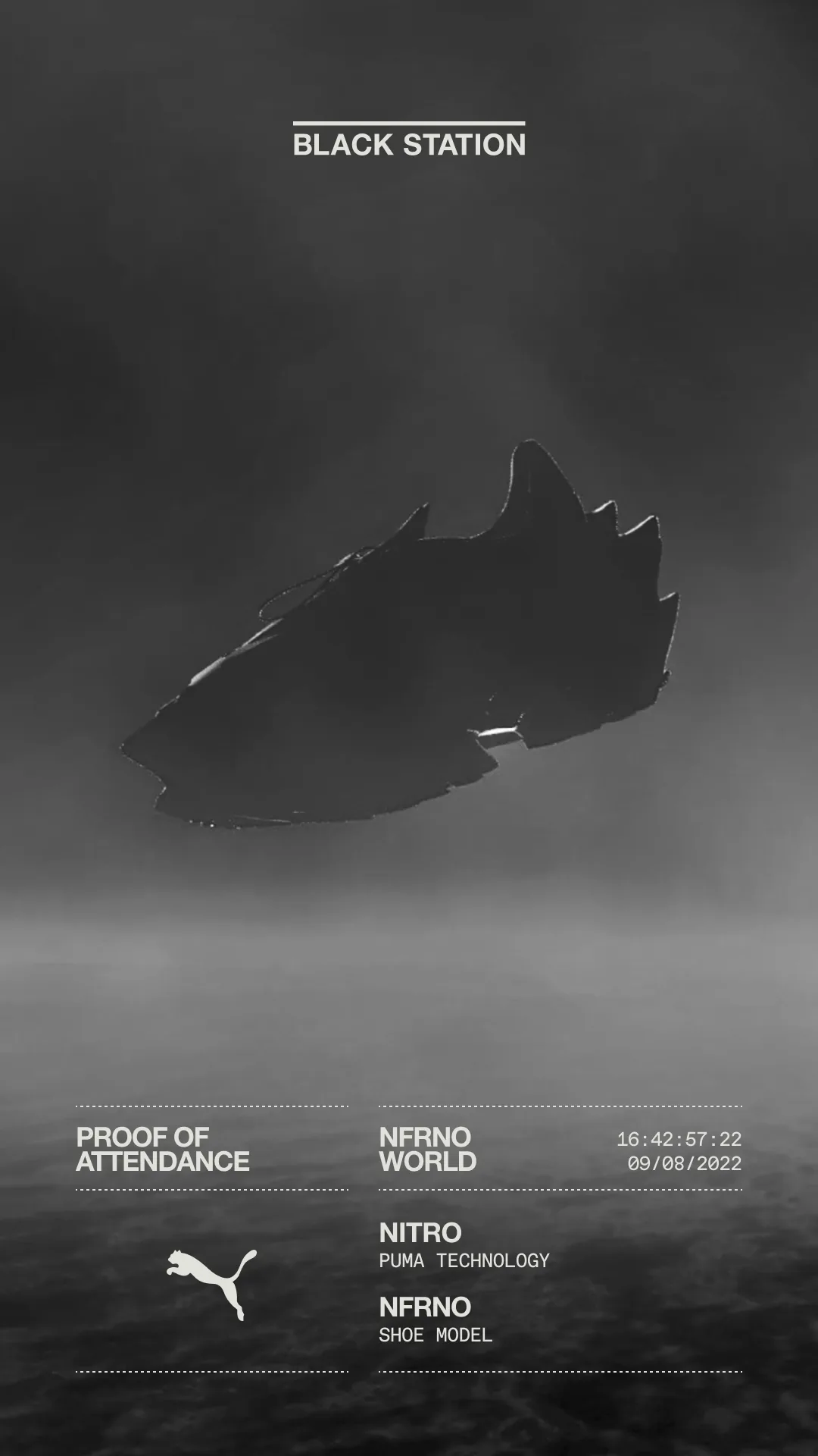
Around the world itself, the campaign assets still had to feel like one product language: sharp enough for the drop, clear enough for the flow, and flexible enough to carry different product moments.
03 / Final cardCampaign
NFRNO hits last.
That kind of work gets invisible when it goes well. Which is exactly the point.
superhuge
Puma Blackstation note
Across the finish line
This one had scale. It had pressure. It had real complexity. And it made it across the finish line looking sharp.
That is a very good feeling.