Europe-China equine business platform
Qian Lu International
A custom multi-page business platform for a Europe-China equine trading, talent, and travel company.

Europe / China
Business platform
Not a nice website.
A clear public face for horses, trade, talent, travel, relationships, and a business with a lot going on.
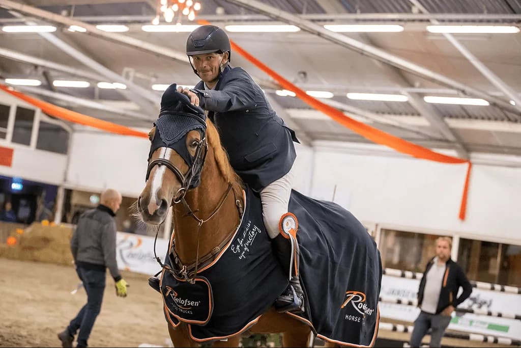
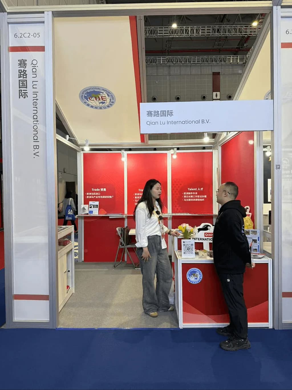
This was not a let's make a nice website kind of project.
Qian Lu International already had a real story. Europe and China. Horses. Trade. Travel. Talent. Relationships. A lot going on, basically.
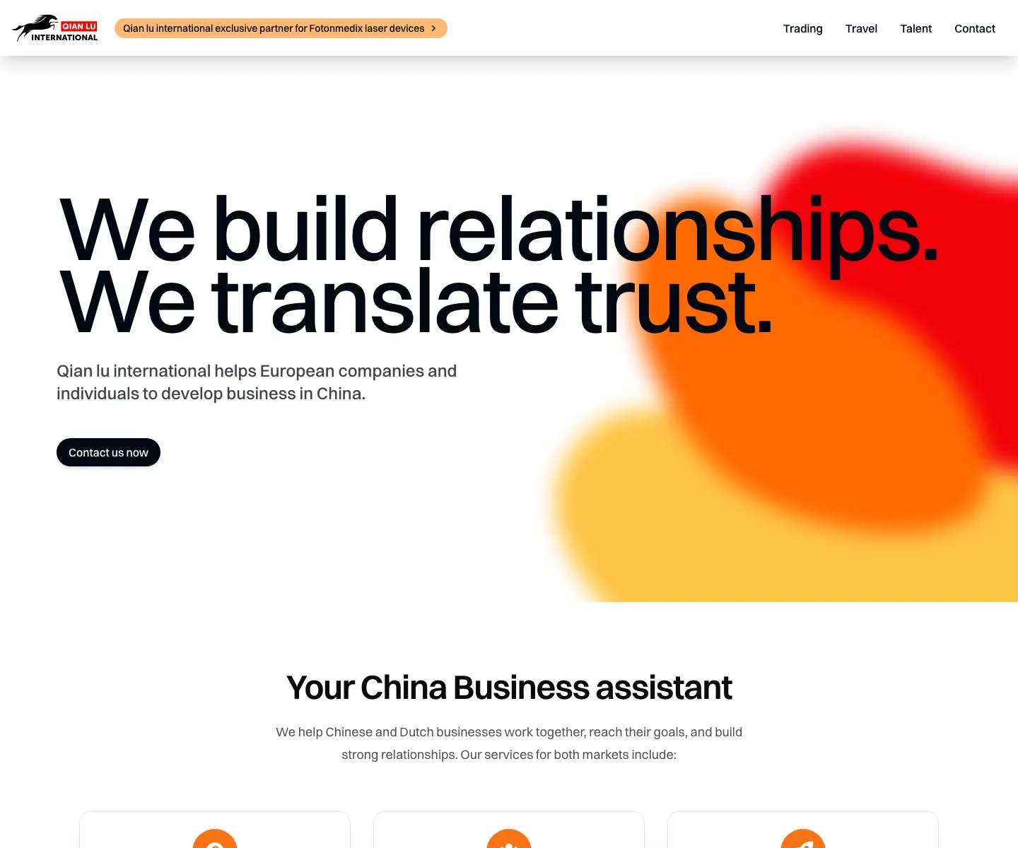
The challenge was to turn all of that into something that felt clear, credible, and easy to act on. So I built a custom multi-page platform that gives each part of the business its own place.
Trading, Talent, Travel, Contact. Nice and simple. No giant wall of text pretending to be strategy.
01
Trading
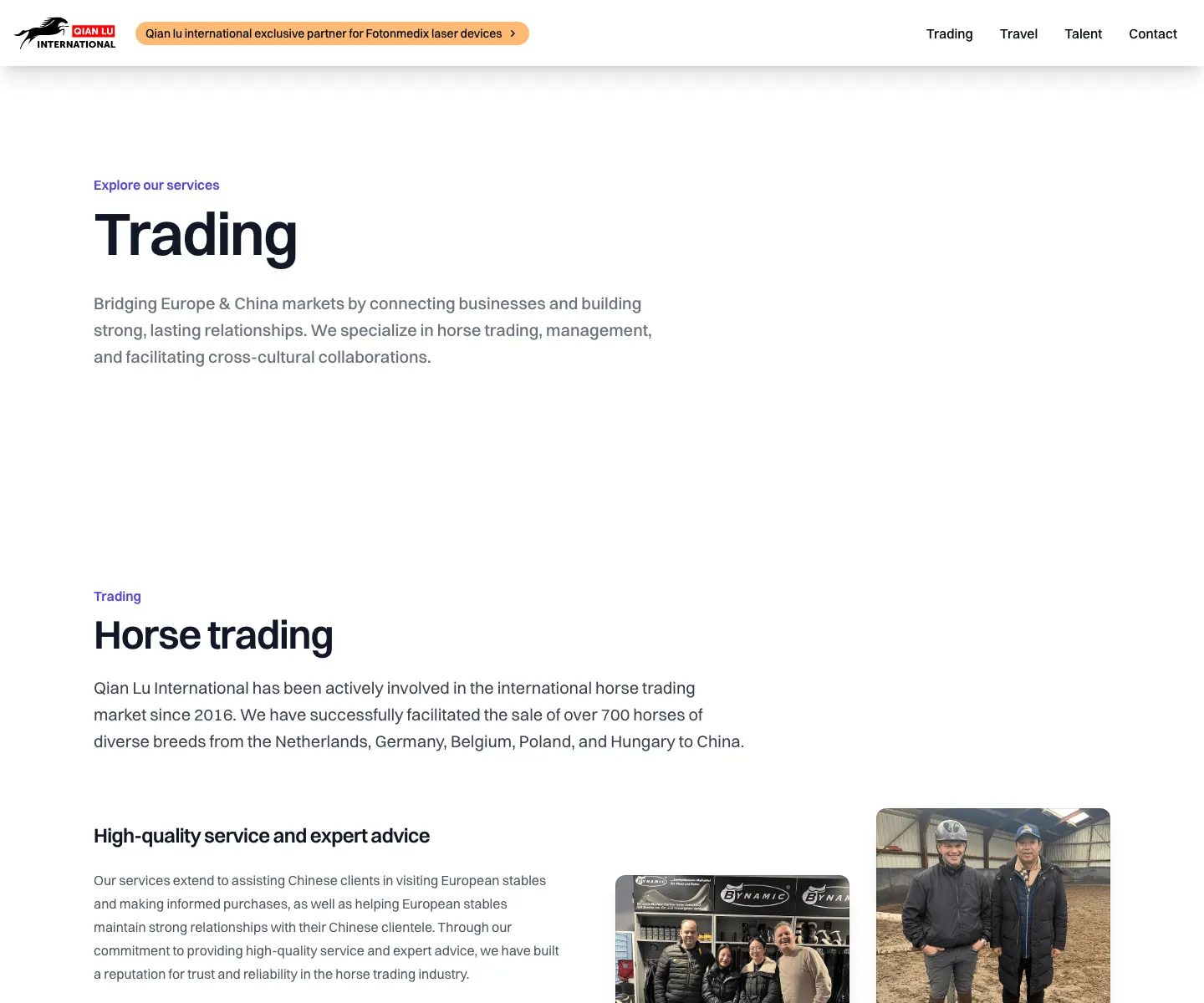
The proof-heavy service page: story, numbers, imagery, network, and product promotion in one flow.
02
Talent
A route that makes recruitment feel like an actual intake path instead of a loose paragraph.
03
Travel
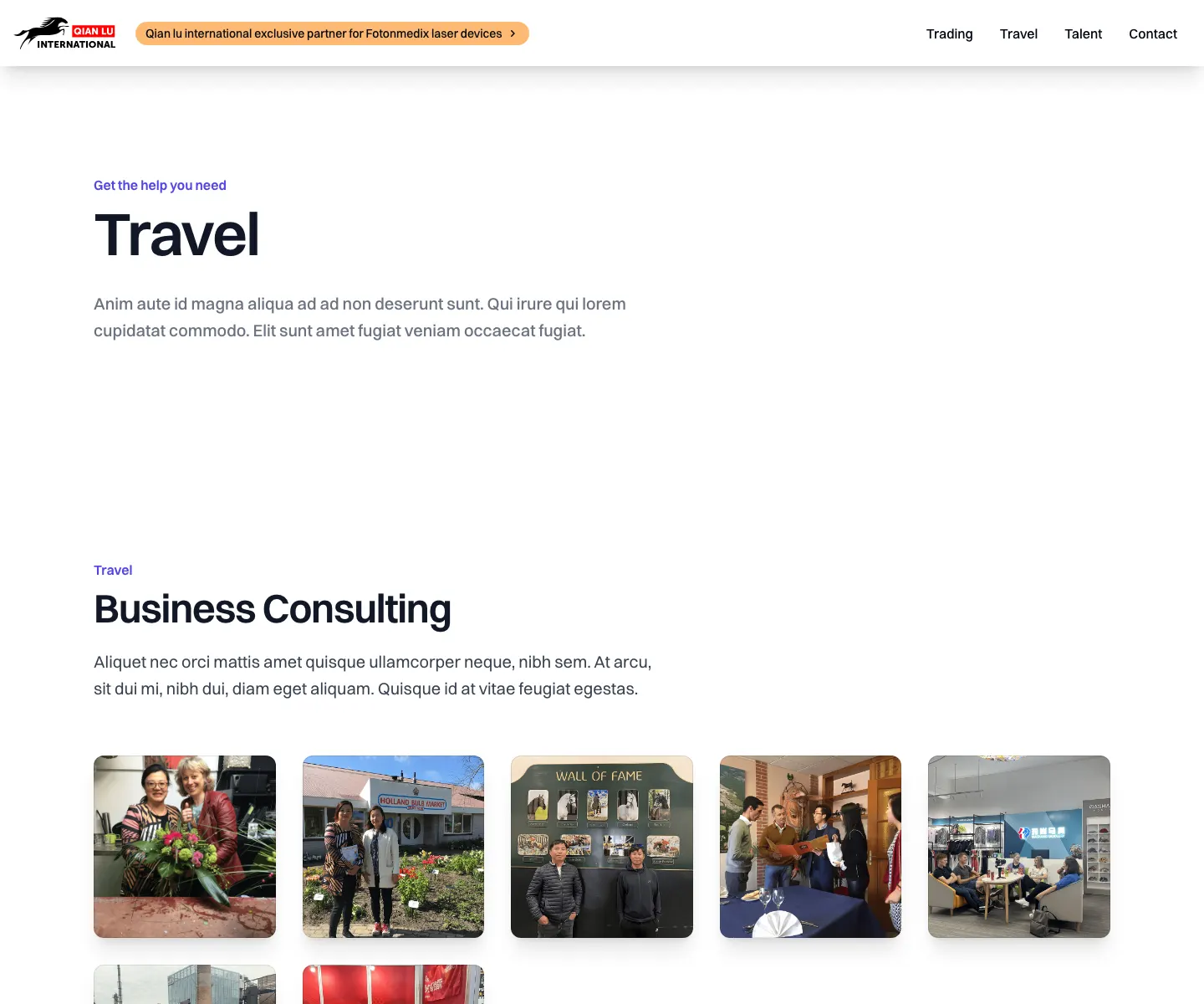
A service page that turns trips, relationships, and coordination into something visitors can act on.
04
Contact
Direct WhatsApp, phone, email, company data, team members, and the practical details people need.
It needed to make people trust the business. Fast.
Proper service pages. Strong proof. Testimonials. Partner logos. Real company details. Team members. Direct WhatsApp, phone, and email links. The kind of stuff that reduces friction instead of adding more poespas.
The Trading page is probably the best example. It brings together the business story, the services, the numbers, the imagery, and the broader network in a way that makes the company feel established. Not startup established. Actual established.
Trust architecture
Credible fast.
Partner logos
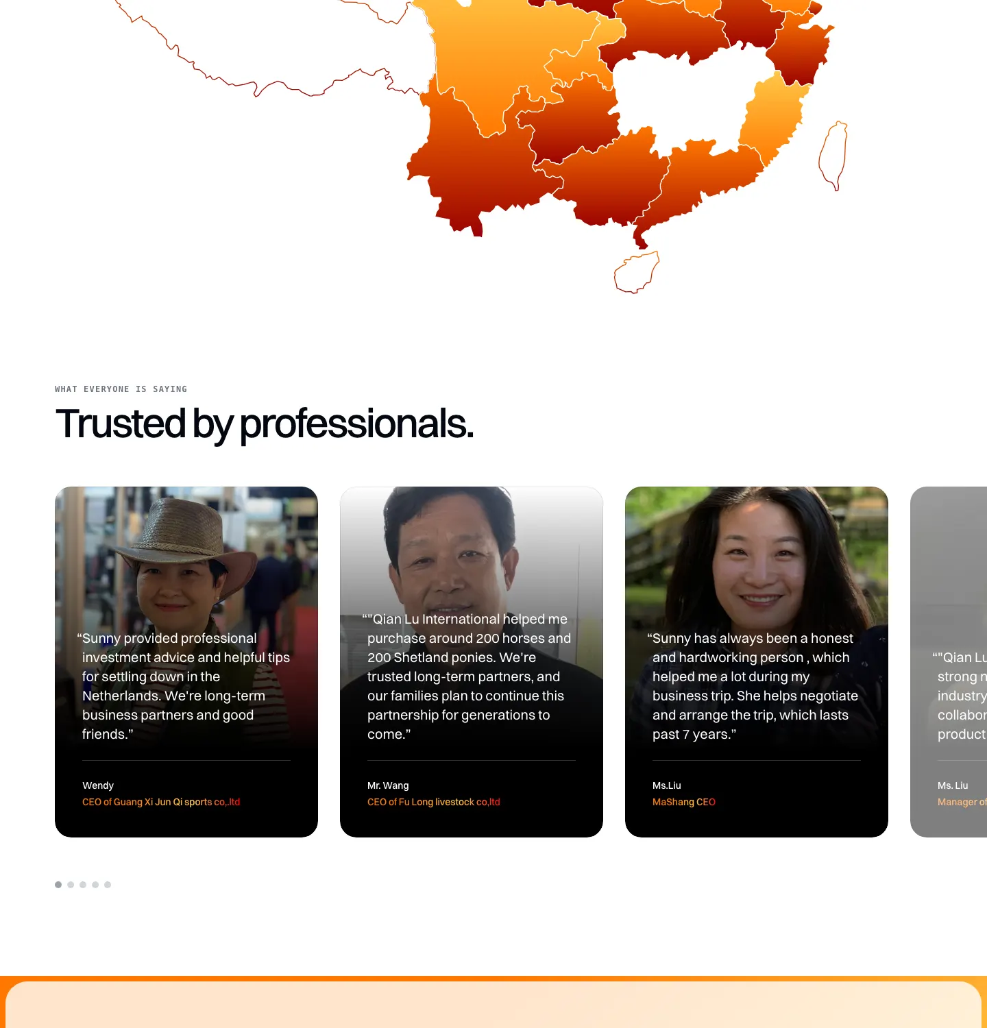
Testimonials
Legal details
Team profiles
Maps
Direct contact

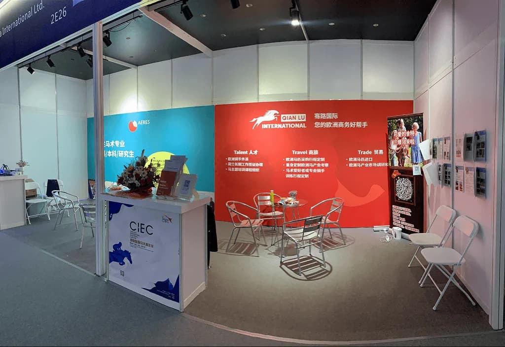
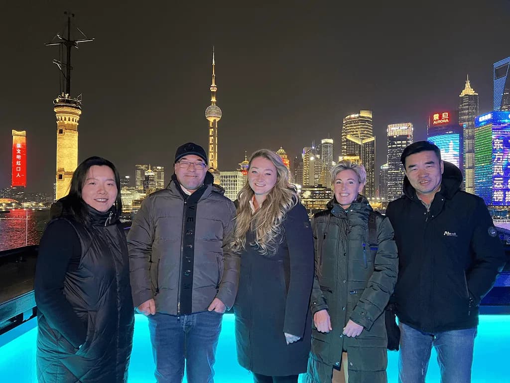
Operational, not decorative.
Talent and Travel both lead somewhere. Contact actually helps people get in touch. The whole thing works more like a business platform than a brochure site, which is exactly what it needed to be.
And it did not stop at the website. The broader marketing layer mattered too, because this was the public face of the company across digital and physical touchpoints.
Live website
The real thing.
I wanted the case page to show the actual public surface: homepage, service routes, contact flow, and proof section. More useful than only showing the loose source images.
Trading
Proof, network, numbers, and product logic on one page.
Travel
A service route for trips, meetings, and guided business access.
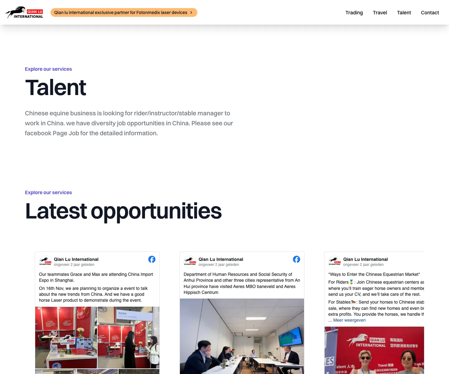
Talent
A cleaner path for internships, exchange, and international work.
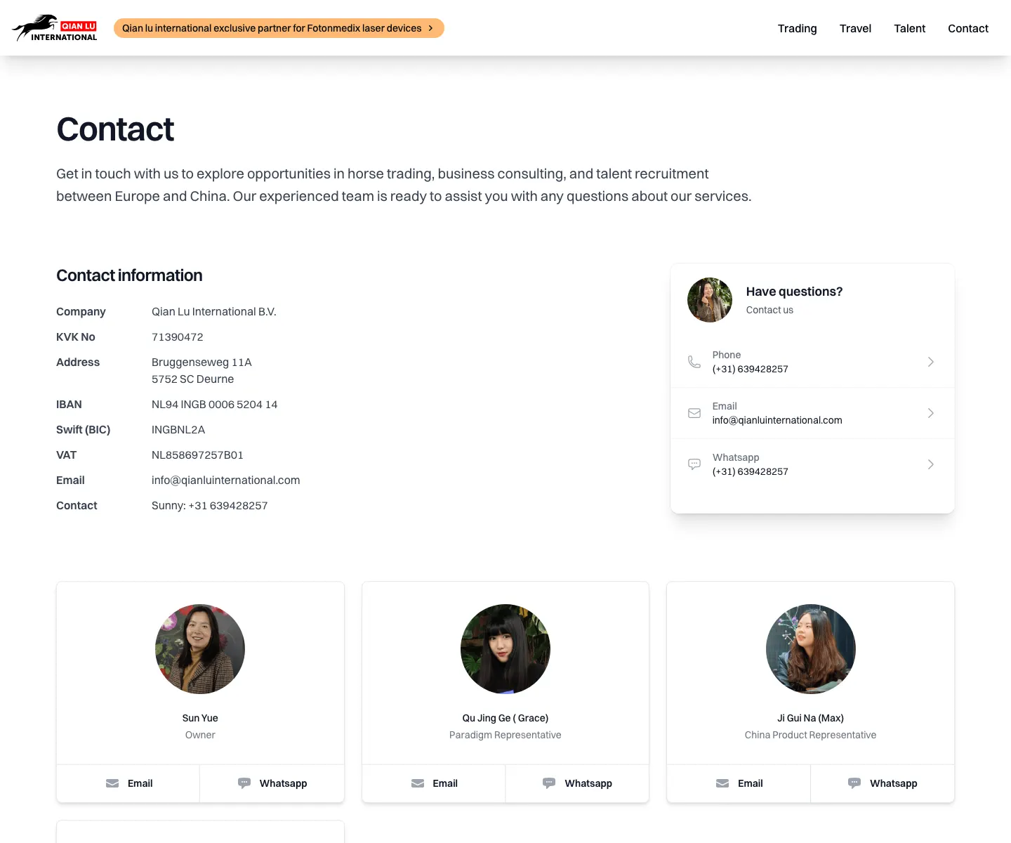
Contact
Direct ways in: phone, email, WhatsApp, company details, people.
Social proof
Trust you can see.
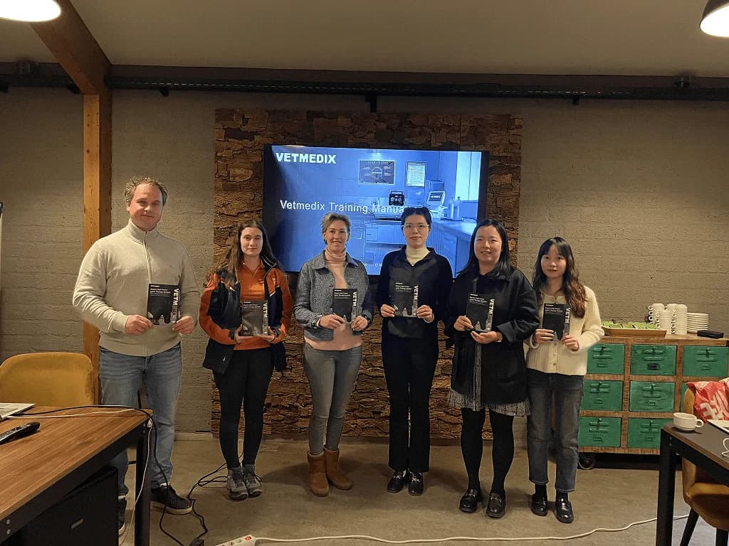
Full spiel
More than the website.
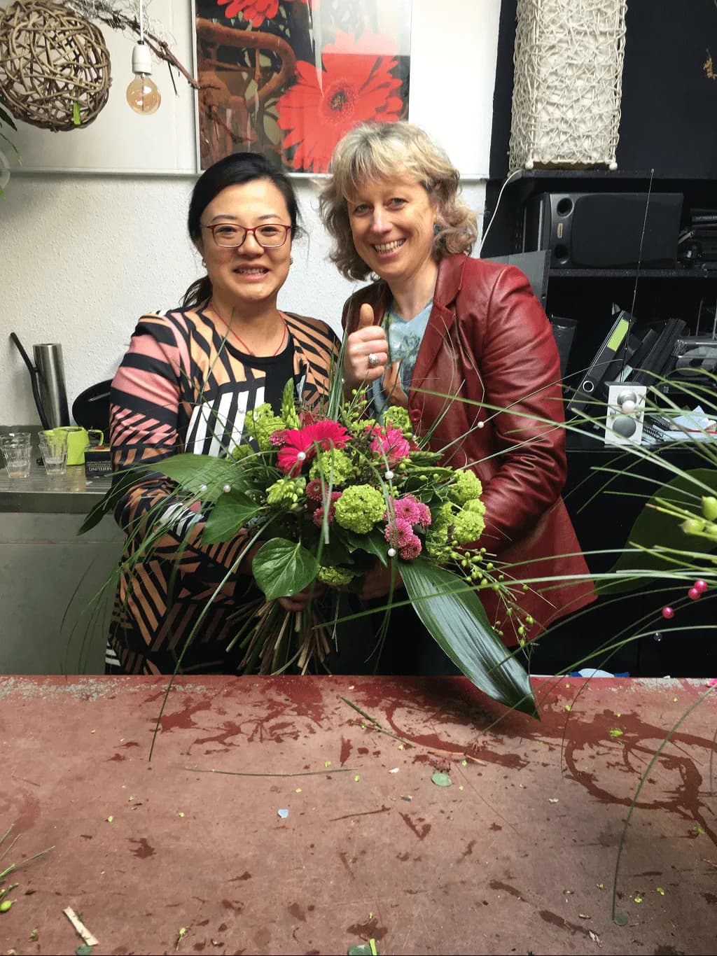
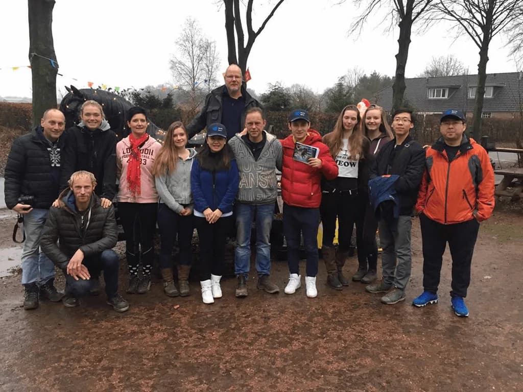
Branding, brochures, offline media, banners, Facebook posts, promotional material, and the public layer around the company.
Under the hood
Practical machinery.
01
Responsive navigation
02
Animated interface details
03
Custom Facebook embeds
04
Testimonials and indicators
05
Maps and reusable components
06
Lead flows without enterprise poespas
A complex business ended up feeling straightforward.
Visually, I kept it clean and confident. White space, orange accents, strong photography, rounded cards, custom graphics, and branded details.
Under the hood there is a decent amount of machinery too, but the point was never to make that visible. The point was to make a relationship-heavy business feel clear enough to trust and easy enough to contact.
This is one of those projects where a fairly complex business ended up feeling straightforward. Which, honestly, is usually the job.
superhuge
Qian Lu project note